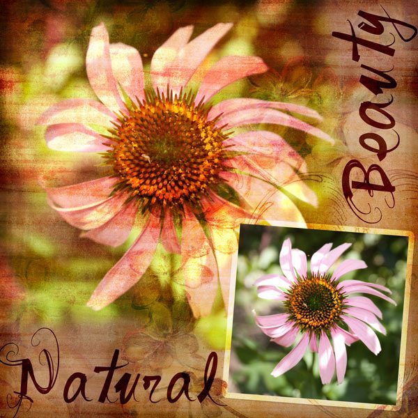
For the purpose of this tutorial I am going to do a layout where the photo blends into the background paper, and a second smaller, crisper copy of the same photo for a repeated effect.
For some using blend modes in Photoshop is second nature, and it is a relatively simple method but for those who have not yet discovered it, here is a quick tutorial. To start my layout, I have selected a background paper and feature photo.
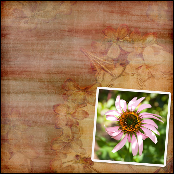
Next I am going to place a larger version of the image on the background paper, underneath the smaller version of the image.
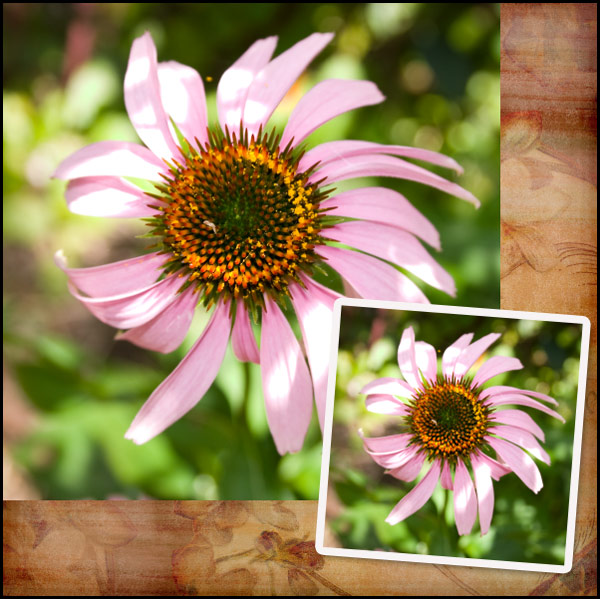
Next while the larger flower layer is selected, we need to change the blend mode. In your layers palette you will find a little white rectangular box which currently has normal selected, if you click on the drop down arrow, you will see the blend mode options available.

There are several different modes to choose from, and each will have a different effect and are great to experiment with but for the purposes of this tutorial we are going to use Overlay mode.

Once your layer blend mode has been changed to Overlay, your photo will look something like this.
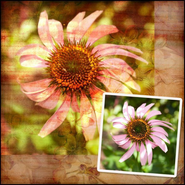
As you can see the look is quite effective and quite vibrant, you can make it look less vibrant by adjusting the layers opacity. This will in turn bring more of the colours of the background through, and soften the colours in the overlaid photo. This option is worth experimenting with to suit your taste.
At this point while I like the effect on the photo, I feel the edges need blending into the background a little more. I like to use layer masks for this purpose to make corrections easier. While your larger photo layer is selected. Click on the Add Layer Mask button.

This will bring up a second thumbnail next to your image in the layers palette. To ensure the mask is selected, click on the mask to show the four corners surrounding it showing it has been selected.

Once you have done this, you can use your black soft brush to remove portions of the image, and the white soft brush to add them.
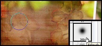
If you make a mistake, you can simply change the brush colour to white to add back the portion of the picture you wish to. On my layout, I softened the edges two sides of the photo to blend them into the background a bit more.
To finish off the layout, I changed the stroke blend mode around the smaller photo to overlay in the layer styles and reduced the drop shadow to bring it more in keeping with a graphic style layout. I then added the titles in dark brown and changed their layer blend modes to Linear Light at 59% Opacity. I also reduced the saturation of the colour in the background of the smaller photo, to help bring out the pink a little more.
© Clikchic Designs 2009 Credits: Cupids Bow by Clikchic Designs Font: Vtks Sonho
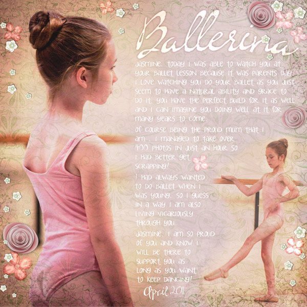
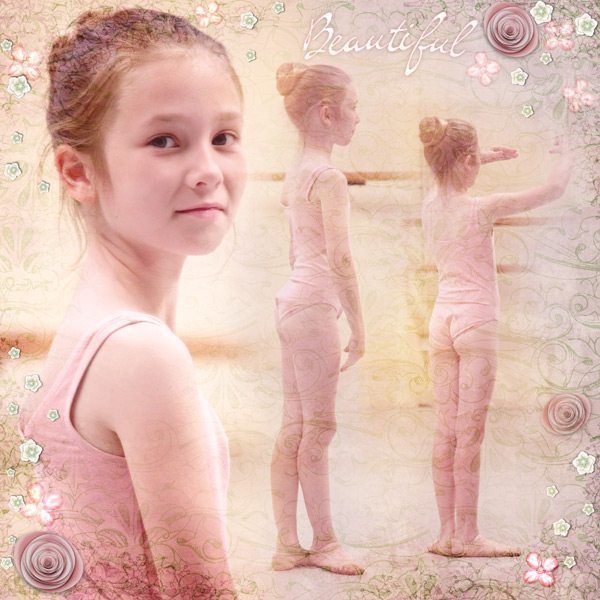
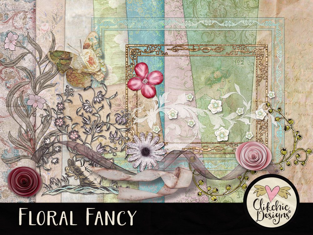
Here are a couple of blended style layouts I have created with my Floral Fancy Digital Scrapbook Kit and some photos of my daughter at ballet.
Subscribe to the Clikchic Designs Newsletter and get a FREEBIE! There are ongoing freebies as well. Don't worry, we won't inundate you with emails.
