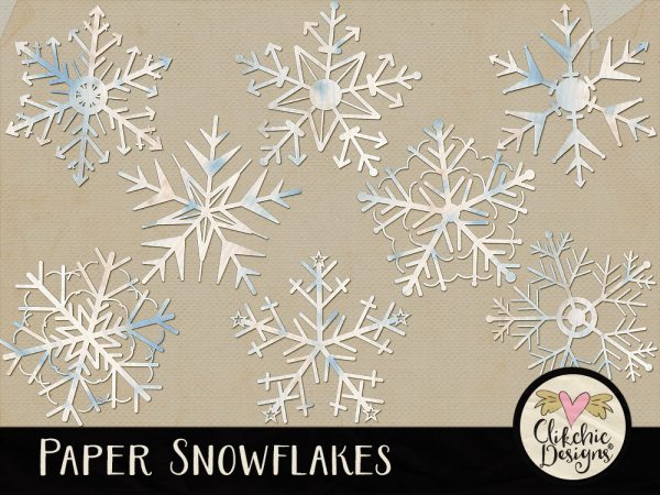
These icy paper snowflakes digital scrapbook embellishments are perfect for adding that finishing touch to your layout and giving it a wintry feel. Create a blizzard or use individually as minor accents, there are many ways to make the most of these gorgeous snowflakes. Paper Snowflakes is available in my Etsy store.
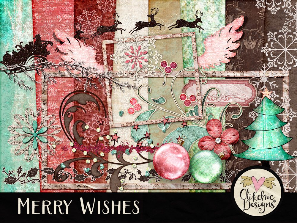
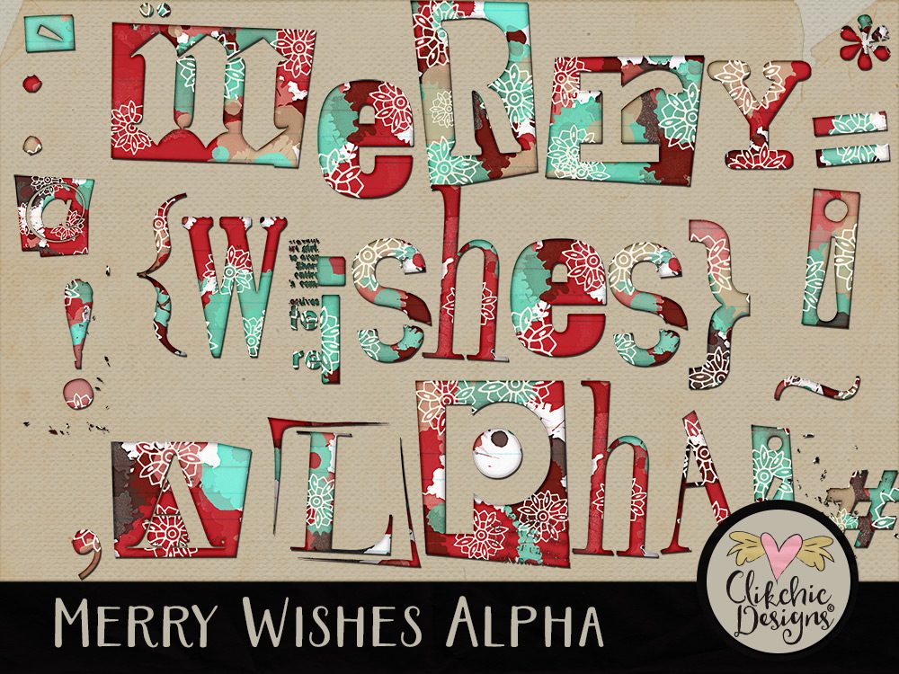
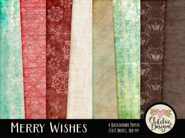
Check out my Merry Wishes Digital Scrapbook Kitand Alpha now available in my Etsy Store. Scroll on for the backgrounds available seperately for those who don’t need the embellishments.
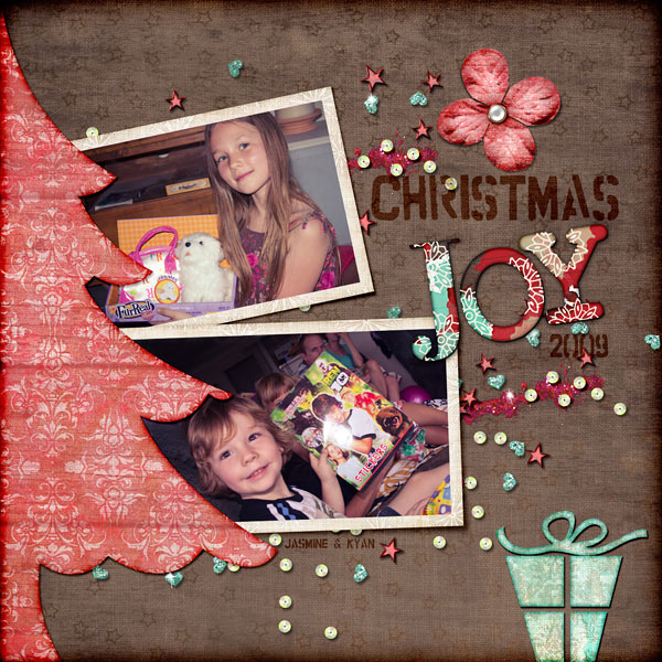
Beautiful rich and warm tones are perfect to warm you up through winter and prepare you for the festive season. Get your Christmas cards ready and last years Thanksgiving and Christmas photos scrapped with this quirky kit, ideal for both paper style and blended style digital scrapbooking.
You can also get the backgrounds seperately if hthat is all you need. The Merry Wishes Backgrounds are available in the following stores.
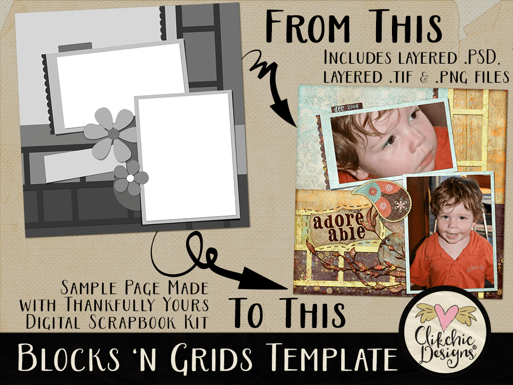
Now in my Etsy Store is the Blocks ‘n Grids Layered Template. Create a layout showcasing two photos or Show a precious event, series of photos (using grids) or inspiring moment with gorgeous paper accents. The possibilities are endless.
Fill (or clip to) the template layers with photos and or background papers to create your own unique layout where the design is done for you. This template includes a layered .psd, layered .tif, and separate .png file layers, and are able to be used in any application that supports layers, transparency and the ability to make selections.
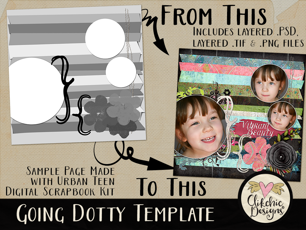
Create a complex layout, fast, with the Going Dotty Layered Template. Create a layout showcasing three photos or Show a precious event, series of photos or inspiring moment with gorgeous paper accents. The possibilities are endless. The Going Dotty Layered Template is available in my Etsy store.