I hosted a speed scrap and the inspiration I used was an interesting one.
One of the participants suggested right up that it was graphic style and the inspiration certainly is, but I think you could easily do a paper style layout with this inspiration also. I loved the arty effects on the photos and decided to do a similar effect on my own.
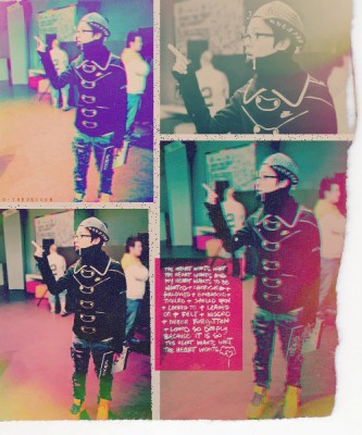
Here is the inspiration image which I found on pinterest. I loved the creative colours on the images! It looks as if the artist has blended colorful textures over the top of each image.
Right off the bat I knew I wouldn’t be able to create the same effect but I did want to try and do something similar in style. I do all my layouts in square format so the shape was going to be different also.
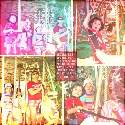
I had some lovely colourful photos of my kids and husband on a merry go round and thought they would be perfect for this kind of project and decided to use them for the speed scrap. When I follow a speed scrap inspiration I often try and capture the general feel of the inspiration rather than copy it perfectly and this is what I have done in my layout. I arranged four different photos on a page with a creamy coloured background underneath from my Childhood Adventures Digital Scrapbook Kit, not necessarily exactly the same layout as in the inspiration.
Prior to placing my photos on the page I edited them in Adobe Camera Raw using a split tone effect to give the photos some slightly unusual or cross processed looking colours. I teach a class on Adobe Camera Raw at Digital Scrapbook Place and one of the things you learn in the class is how to do a split tone effect.
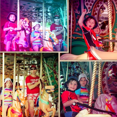
Below is an example of one of the photos with and without the split tone effect applied.
Click on the image to see a bigger view of the example. The split toning immediately gives the photo/s a more surreal and colourful look which is the start of what I wanted to achieve.
After the photos were placed on the page I created gradients over each photo using colours in the inspiration image. I did this to give uneven colour tones to the image. Each gradient was then given an overlay blend mode to allow the colours to overlay the image below but still allow the images to show through. I reduced the opacity of each gradient to suit each photo.
At this point I found that the effect was a bit strong and I wanted to tone it down a bit.
At this point I decided to tone the colours down and to add some texture I would reuse the creamy background (from Childhood Adventures Value Collection) I used in the background, over the top of the photos with a linear light blend mode and reduced opacity. This softened those harsh and bright colours and gave the entire layout varying and interesting texture.
I then used the red paper from the Childhood Adventures Value Collection to create a rectangular journal block near the center of the page, similar to that in the inspiration image. I placed the journalling over the top of this journal paper in white to enable it to stand out clearly against the background which was also blended using the pin light blend mode. Each photo and the journalling paper also had drop shadows added for a little extra depth. (not something usually done in graphic style layouts but I like to, to add definition)
I also added a fill layer over the top of all layers with opacity reduced to zero and an inner shadow with a colour burn blend mode to create some soft and subtle borders to help retain the eye within the layout.
Below is the final layout, which as you can see looks a bit funky and arty and a little bleached out, but is an effect I quite like for something a little different.
Subscribe to the Clikchic Designs Newsletter and get a FREEBIE! There are ongoing freebies as well. Don't worry, we won't inundate you with emails.


