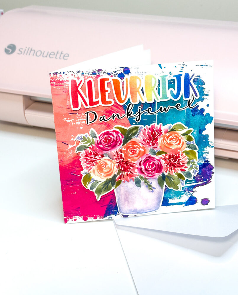
Creating your own handmade Thank You cards is a wonderful way to share appreciation in a personal and creative way. With digital crafting, it’s easier than ever to design professional-looking cards for a friend or family member using beautiful watercolor backgrounds, floral illustrations, and stylish sentiments. In this tutorial, I’ll show you how to make a unique Thank You card using my designs from the Clikchic Designs Silhouette Store. This project combines a textured grunge-style base, vibrant watercolor florals, and a soft rainbow ombre sentiment to create a heartfelt card perfect for any occasion.
For a quick look at how the project comes together, you can watch the short tutorial video below :at the end of this article. Scroll on to find out what you need.
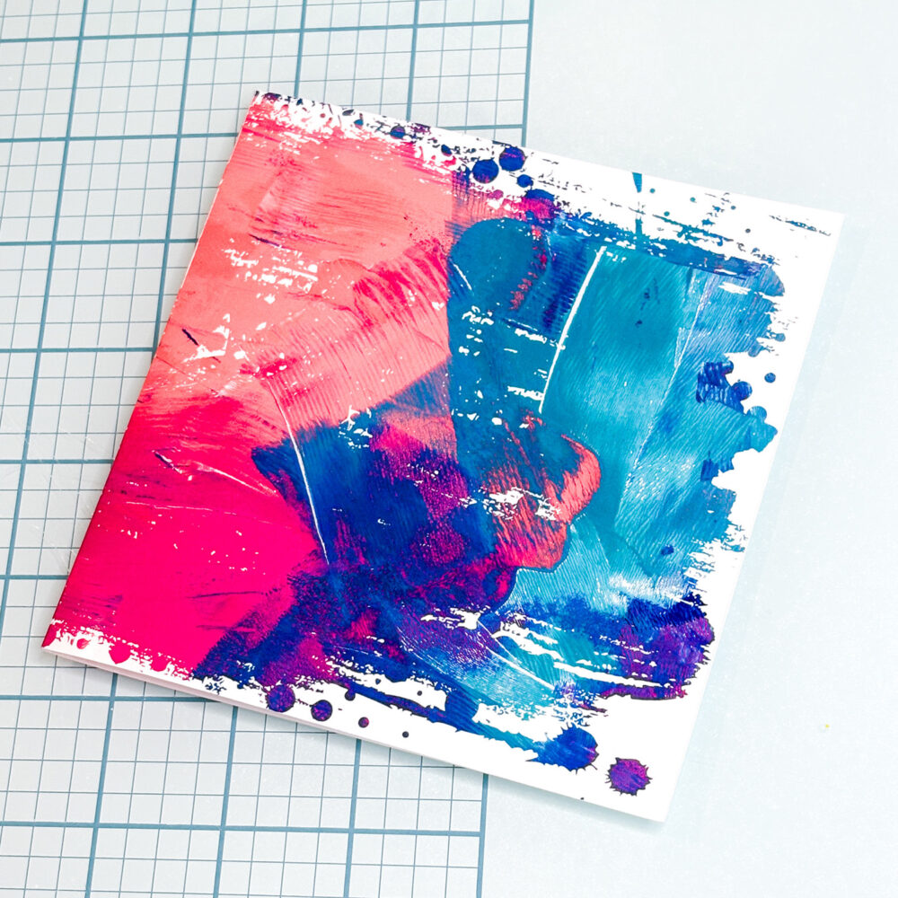
Open the Dotted Mess Urban Grunge Clipping Mask and size to suit your card base. Drag the Fuschia Peach Teal Blue Abstract Grunge Background in Silhouette Studio® to the Dotted Mess Urban Grunge Clipping Mask, hover patiently till the shape fills with the design and then release your mouse. (see this tutorial for more info on this process) Resize it to fit your card base (perfect for a 5×5” folded card). Place the over the background and use it to create a distressed edge effect. Create a rectangle to use as a card base surrounding the grungy framed image and add a score line or snag this freebie to use for this over and over for your square cards. Print and cut this layer on photo paper for a polished finish. (make sure the cut lines on the grungy outline are turned off)
Step 2: Add the Floral Feature
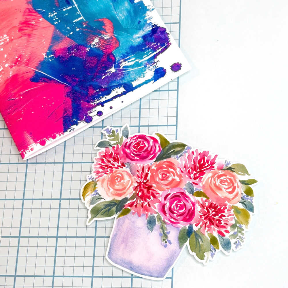
Bring in the Pink Peach Watercolor Roses & Dahlias Flowers in Pot Print & Cut design. Print and cut the floral piece, then attach it to the centre of your card front using foam tape or adhesive for added depth. The delicate watercolor roses and dahlias create a vibrant, eye-catching focal point.
Step 3: Design the Sentiment
Use the Rainbow Ombre Watercolor Gradient Background to craft your “Colourful Thank You” sentiment. Type your message in Silhouette Studio®, fill the letters for “colourful” (Kleurrijk) with the gradient background. Add an offset to the Colourful and thank you that suits you and cut them out using your cutting machine. Position the sentiment above the floral arrangement on the card base using your chosen glue method to complete your design with a cheerful burst of colour. I used foam squares for the flowers and “Colourful” (Kleurrijk) and a glue pen for the “Thank You” (Dankjewel) which is a script font with an offset.
Step 4: Assemble and Finish
Layer your pieces onto the grunge background base. Adjust until balanced, then secure with foam squares or preferred method. The combination of abstract watercolor textures, painterly florals, and a rainbow gradient greeting makes this card a joyful way to show your appreciation.
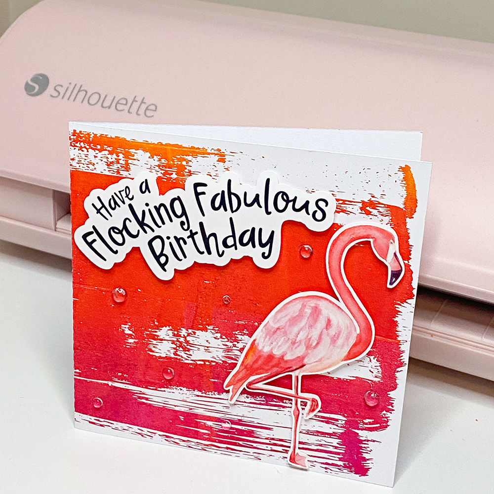
Looking for a handmade birthday card with bold tropical vibes? This flamingo-themed birthday card is bright, cheerful, and so much fun to make. Using a Print & Cut flamingo, a cheeky sentiment, a painted monoprint background, and a dry paint-style clipping mask frame, this project is perfect for Silhouette Studio users who love combining painterly effects with clean digital design.
To recreate this look, you’ll need these Silhouette Design Store files: Flamingo Watercolor Print & Cut (D-1270614) Download here Flocking Fabulous Birthday Sentiment (D-1270612) Download here Yellow Red Magenta Monoprint Background (385854) Download here Dry Paint Grunge Clipping Mask Frame (D-368127) Download here
Cut the sentiment from coordinating cardstock, or print and cut using the include offset.
Assemble the card using glue or foam tape to add depth and dimension.
The finished result is a fun, layered birthday card perfect for summer celebrations and flamingo fans alike. See the full process in the Instagram Reel! (don’t forget to follow!)
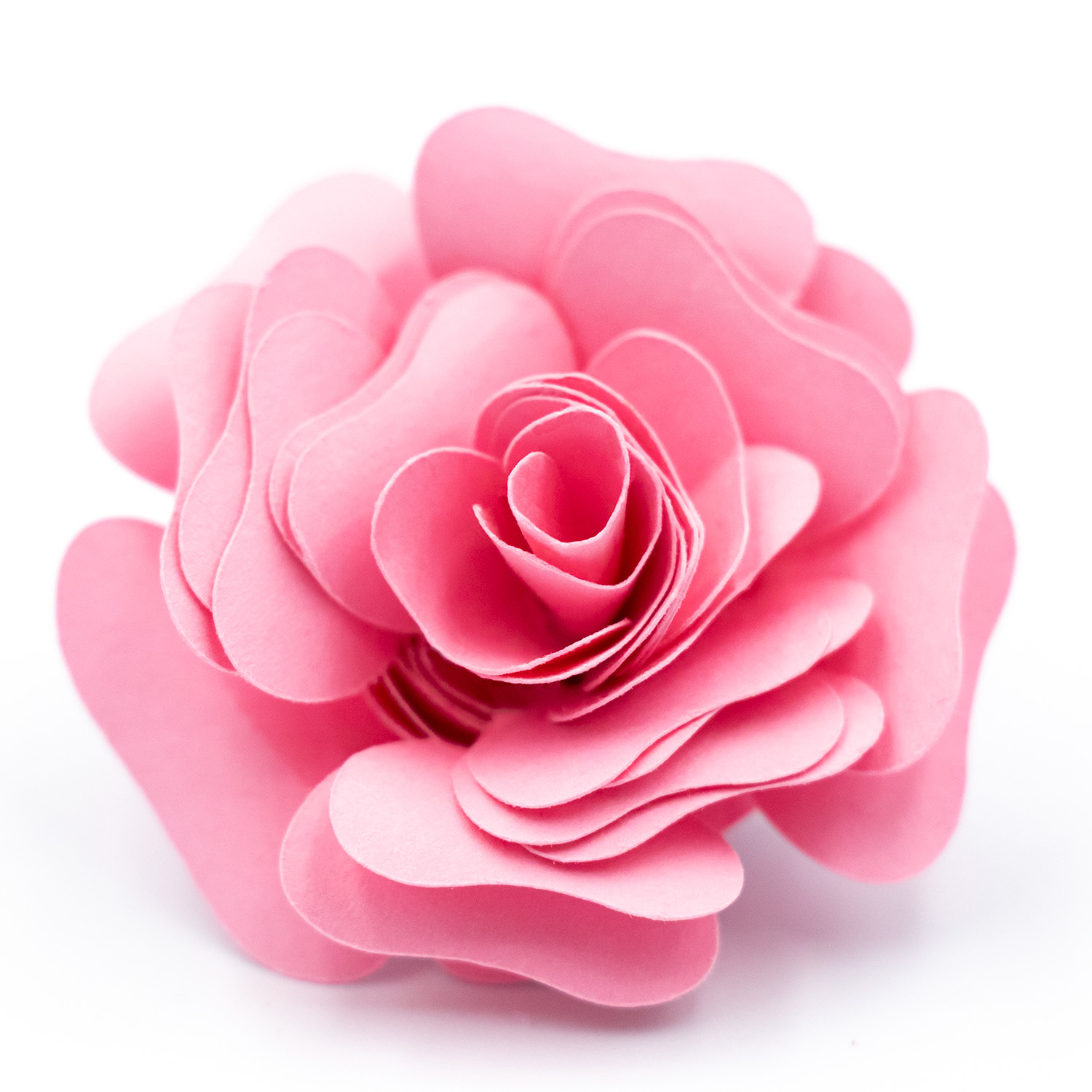
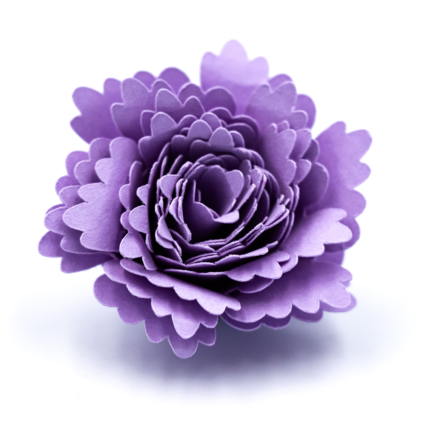
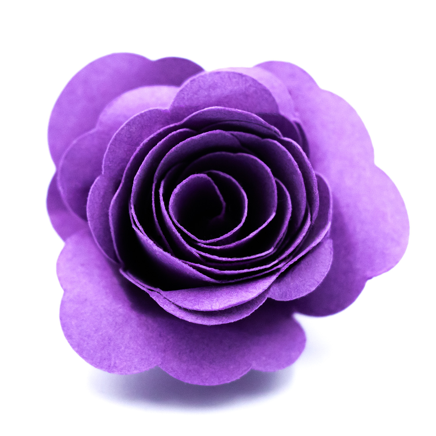
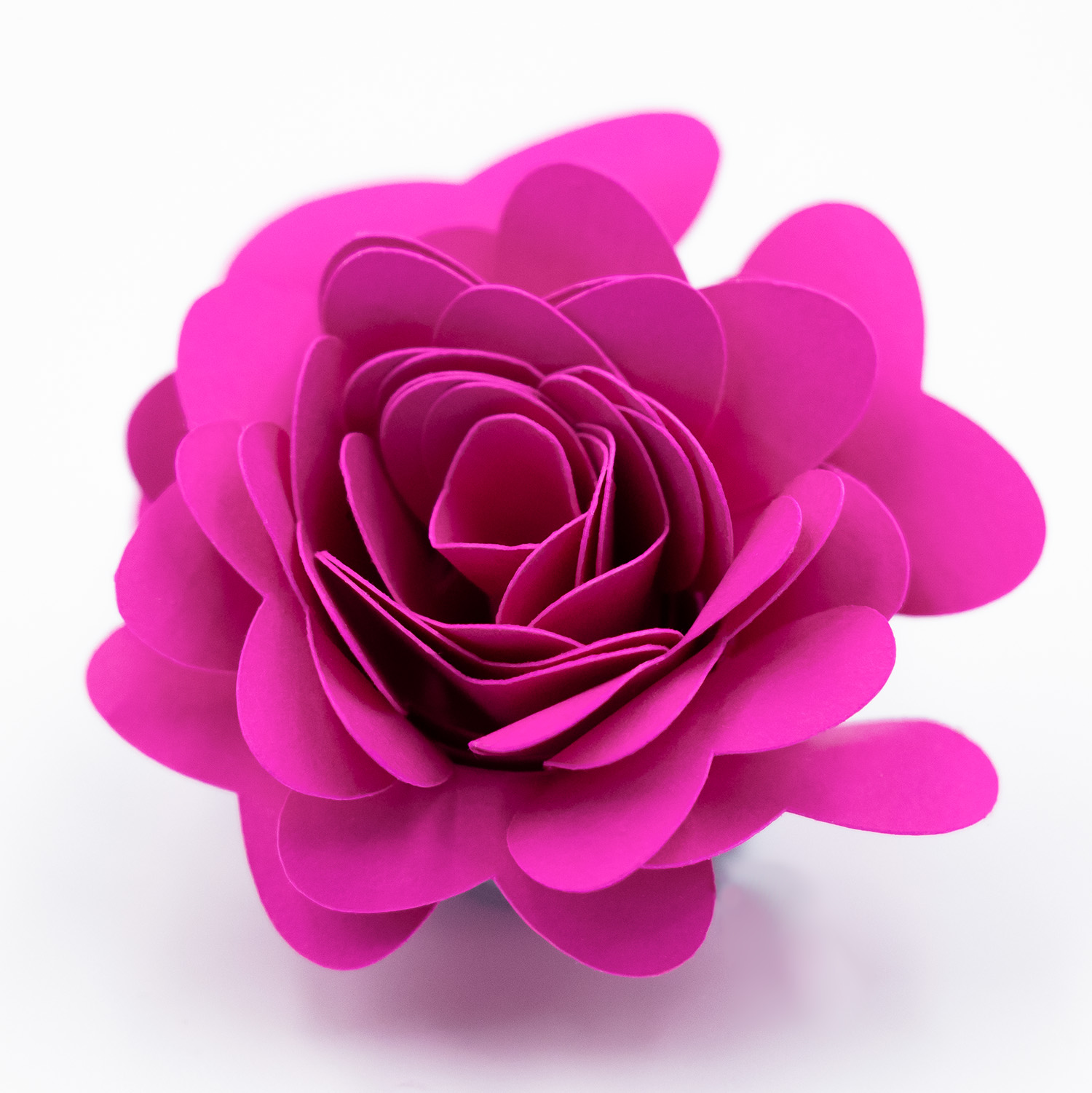
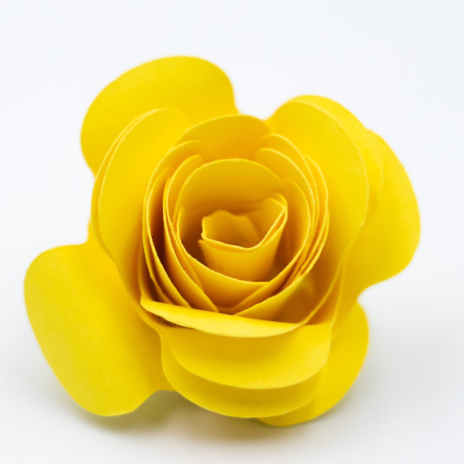
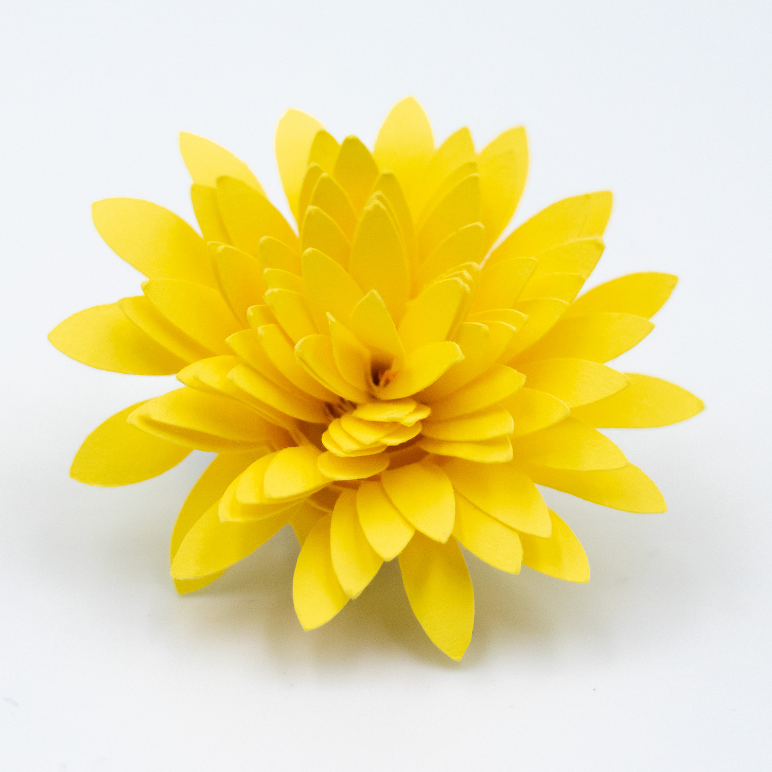
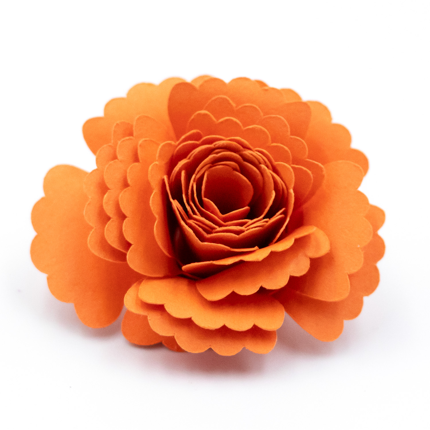
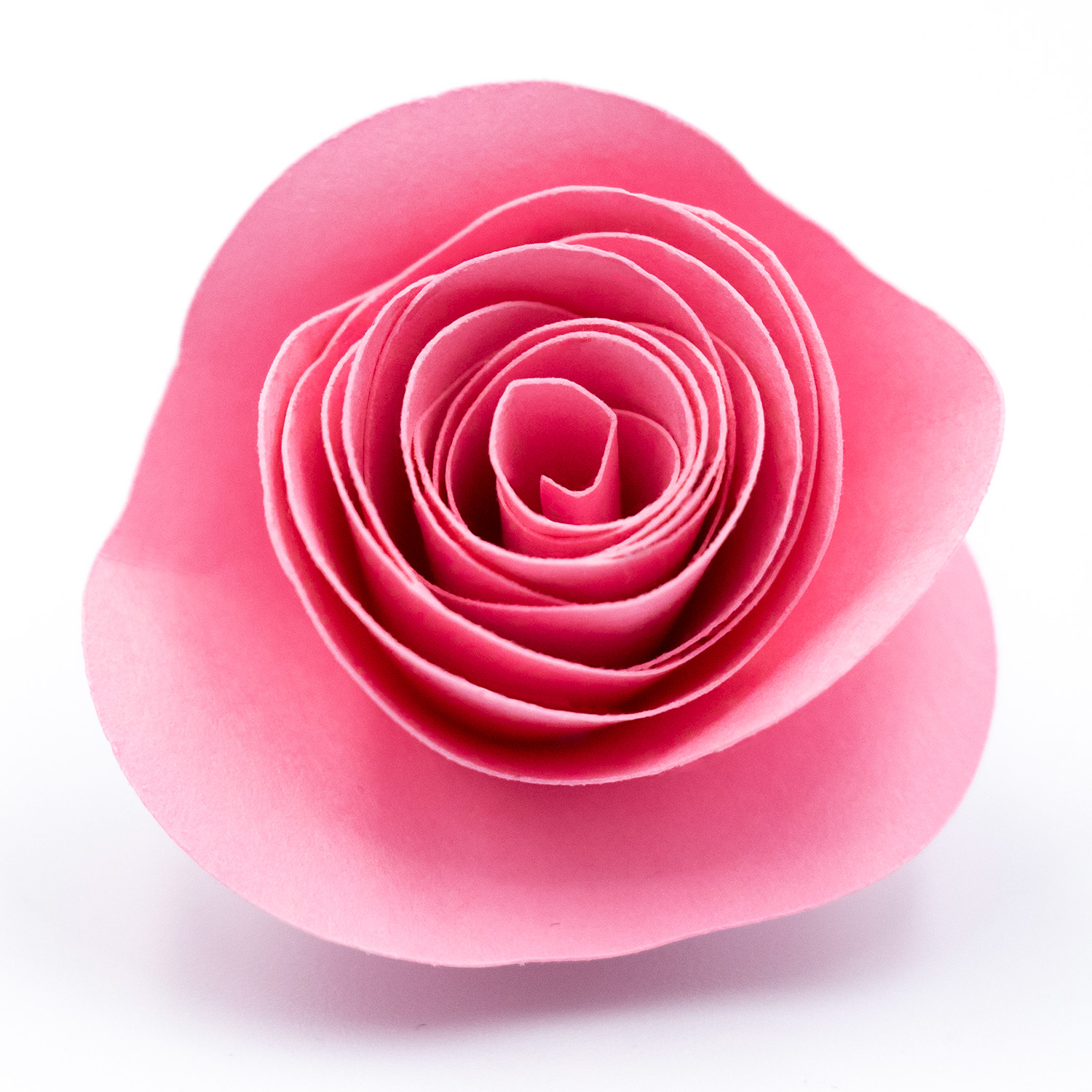
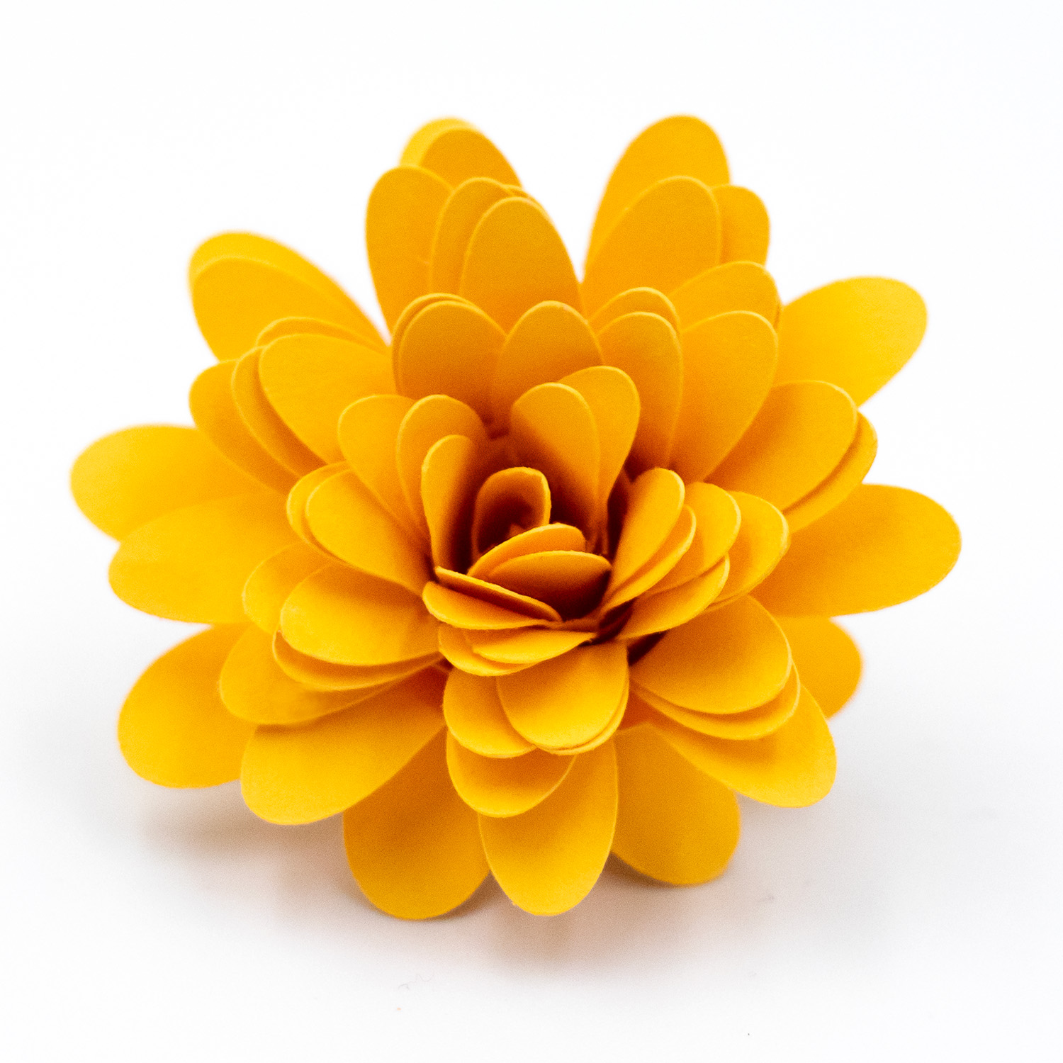
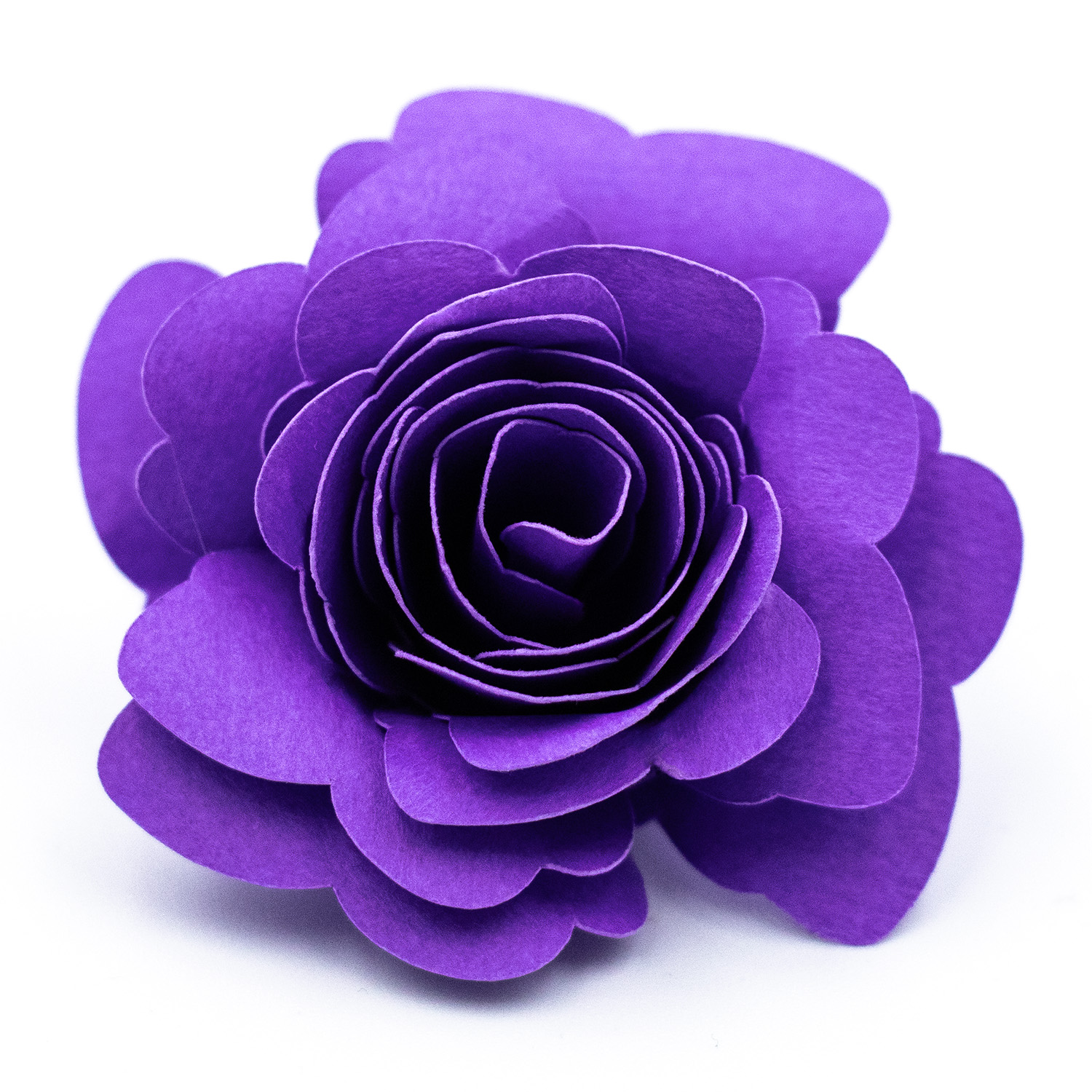
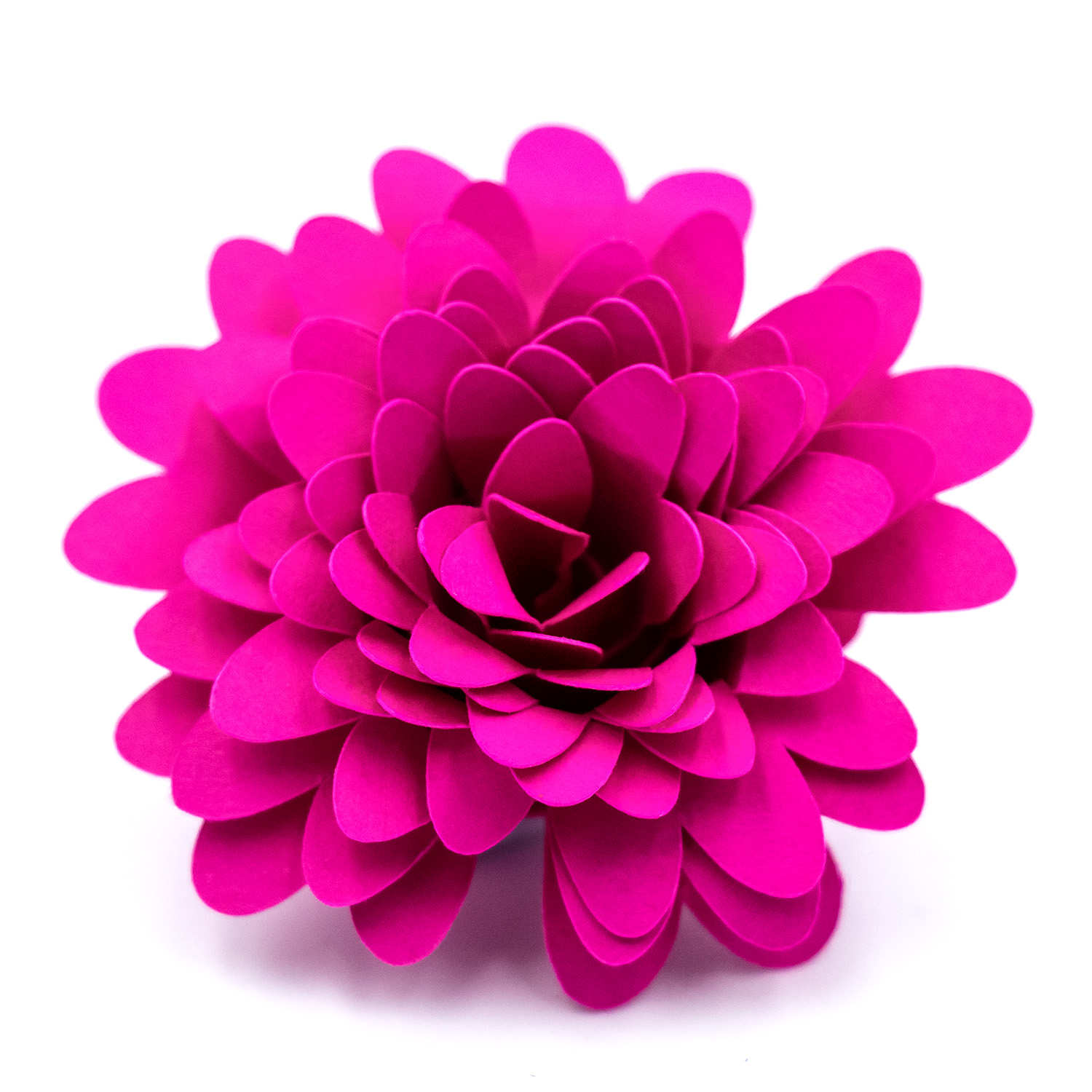
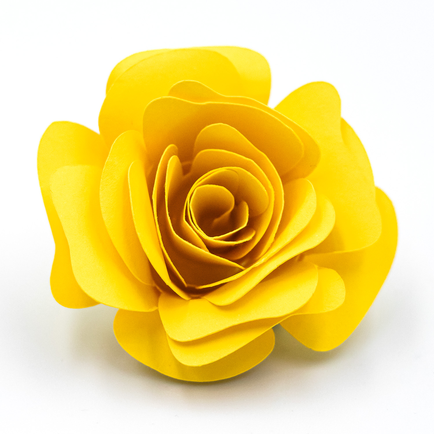
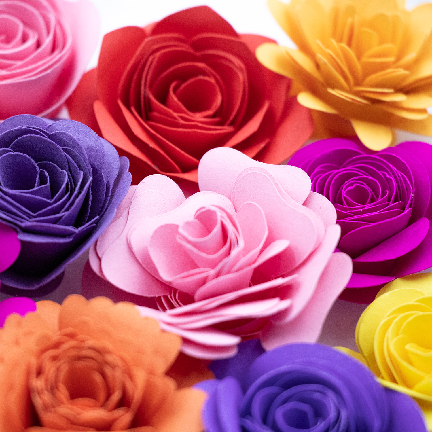
Rolled paper flowers are a beautiful, easy-to-make craft perfect for cardmaking, scrapbooking, home décor, and party decorations. With just a few supplies, you can create realistic blooms in minutes. Prefer to watch and learn? Scroll on to the tutorial or further to the bottom to watch the step-by-step video on YouTube.
Cut the Spiral Shape: Use your cutting machine or scissors to cut out a spiral flower shape from your chosen paper. The design should have scalloped or curved edges for the petal effect.
Start Rolling from the Outside: Begin at the outer edge of the spiral. Use a quilling tool or tweezers to start rolling the paper inward, keeping the bottom edge aligned as much as possible. Wider petal designs with gaps between them require a little more care to ensure petals fold in as you wind the spiral.
Roll to the Centre: Continue rolling until you reach the flat circle at the centre of the spiral. This circle acts as the flower’s base.
Let It Loosen Slightly: Once rolled, gently release the flower so the petals can relax into a more natural shape. Adjust tightness to your liking.
Glue the Base: Apply a generous amount of hot glue to the centre circle and press the rolled petals into it. Hold for a few seconds until secure.
Finish & Shape: You can lightly curl the petal edges outward with your fingers or a shaping tool like a thin paintbrush or similar tool. Add ink or embellishments if desired.
Tips:
For more realistic flowers, use double-sided cardstock or ink the edges.
Larger spirals create fuller flowers; tighter rolls form buds.
Use a thin paintbrush handle or similar to gently curl petals outward for added dimension.
Rolled paper flowers can be layered, grouped, or used alone for endless DIY possibilities.
This tutorial contains affiliate links. If you purchase through them, I may earn a small commission at no extra cost to you.
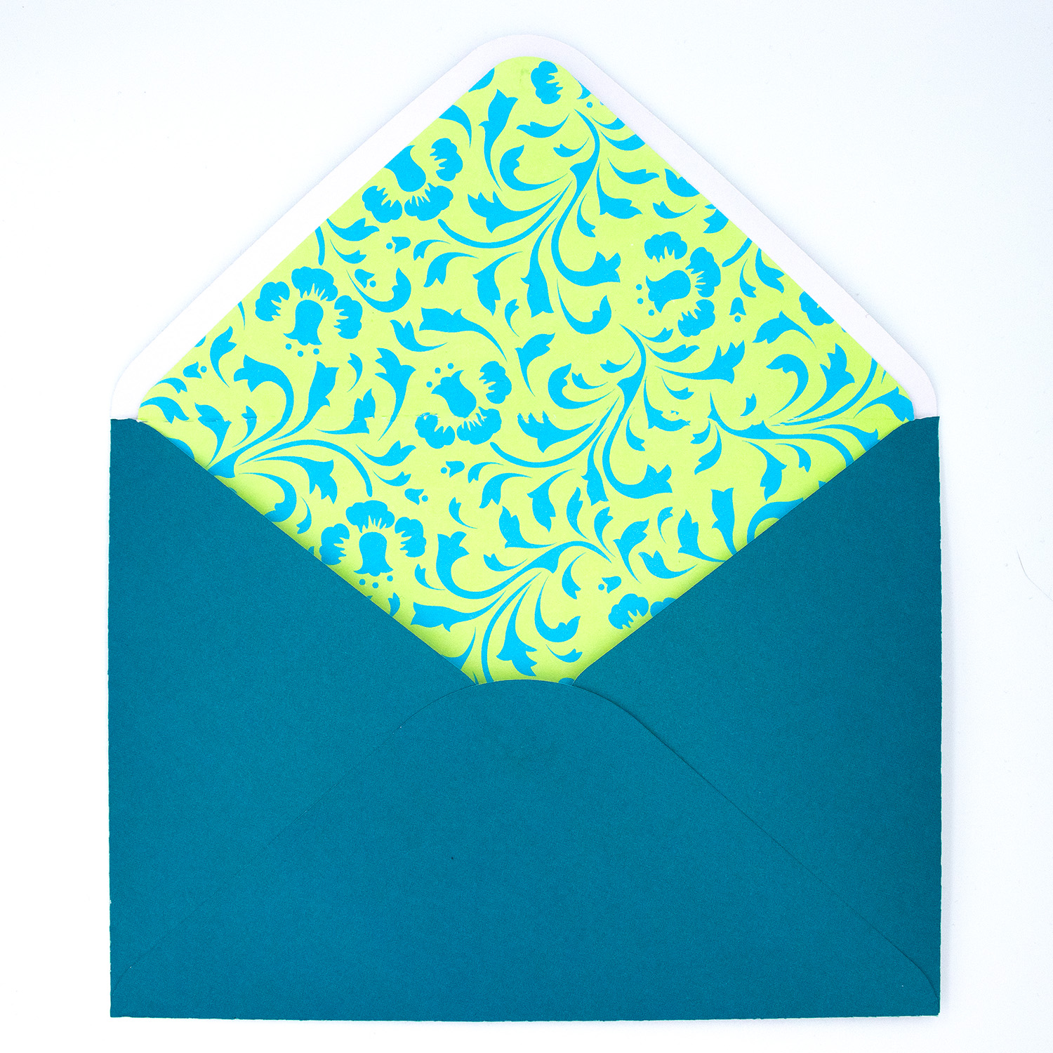
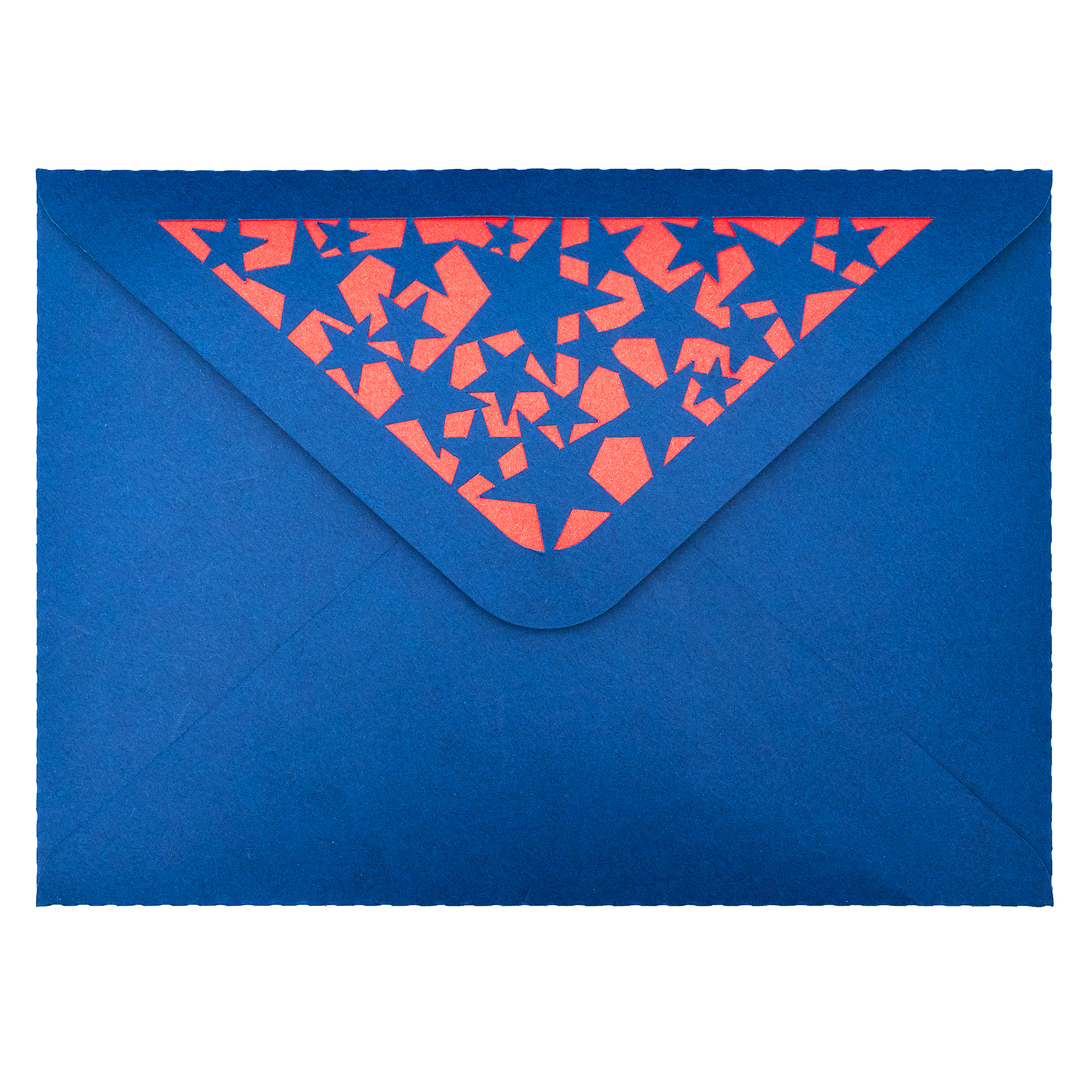
Looking to add the perfect finishing touch to your handmade cards? My 5×7 with liner envelope SVGs features a contrasting liner and some contain detailed cutouts on the opening flap—ideal for various themes including birthdays, celebrations, and more. Follow this easy step-by-step tutorial to assemble your envelope using your electronic cutting machine.
Contrasting cardstock or patterned paper for the liner
Double-sided tape and/or craft glue – glue may be needed for intricate cut areas
Step 1: Cut the SVG File
Start by uploading the SVG file into your cutting machine software.
Cut the envelope base using your cutting machine from sturdy cardstock.
Cut the liner using your cutting machine from lighter or contrasting paper for a dramatic visual effect.
Step 2: Fold the Envelope
Once your pieces are cut, fold the envelope along the score lines.
Fold the two side flaps inward.
Fold the bottom flap upward and the top flap downward to check the fit.
Step 3: Attach the Liner
With the envelope open and flap lifted:
Align the liner centered behind the top flap and/or cutout area keeping fold in correct position.
Apply glue or double-sided tape to the back of the top flap.
Press the liner in place carefully, ensuring it doesn’t extend beyond the edges. Note: attaching the bottom part of the liner to the inside of the envelope can cause issues with opening and closing so it may be best to leave it unattached.
Step 4: Assemble the Envelope
Apply adhesive to the bottom flap.
Fold in the side flaps and fold the bottom flap up and press firmly to secure. Let it dry flat for a few minutes before use.
The Finished Result
You now have a stunning handmade envelope that fits standard 5×7” cards. The inset cut patterns paired with a bold liner adds the perfect pop of personality and style—ideal for gifting, invitations, or patriotic occasions.
Looking for the perfect handmade card for a golf-loving dad? This layered Golf Ball Father’s Day Card SVG is the ideal craft project for your Silhouette Cameo. With its bold golf theme and dimensional layers, it’s easy to cut, assemble, and customise with your favourite cardstock colours. Follow this step-by-step tutorial to create a thoughtful and sporty card that’s sure to impress.
Materials Needed
Silhouette Cameo or Portrait cutting machine (or other compatible machine)
Optional: Matching 5×5” envelope SVG (Design ID D-181609 ) See store links for other available store options
Step 1: Set Up Your SVG in Silhouette Studio
Open the SVG file in Silhouette Studio and arrange the design elements by colour. The default size is for a 5×5 inch folded card, but you can scale it up to suit your preferences. Make sure to use separate cutting pieces for each colour of cardstock.
Step 2: Cut the Design Pieces
Load each piece of coloured cardstock onto your cutting mat and send the design to cut. The file includes:
Card base with Golf Ball, Tee & Happy Father’s Day cutouts
Golf Ball Cutout Background
Word art “Happy”
Tee Cutout Background
“Father’s Day” text cutout with optional backing layer
Card insert for your message and/or backing layer
Use a spatula to gently lift each element from the mat to keep edges clean.
Step 3: Assemble the Card
Begin with the card base laid open. Adhere the golf ball backing to the top half of the card behind the golf ball cutout, placing the tee beneath the tee cutout. Next, layer the “Happy” word art over the ball, then attach the (optional) coloured cutout backing behind the “Father’s Day” cutout text to make it pop. Finally, add the message insert inside the card which can also be used as the optional cutout backing for one of the elements.
Step 4: Optional Envelope
Complete your project by cutting a coordinating 5×5” envelope using Design ID D-181609 . It fits the card perfectly and adds a polished, professional touch.
This sporty, handmade Golf Ball Father’s Day card is a fantastic way to celebrate your dad’s favourite hobby. With a bit of cardstock and creativity, you’ll have a one-of-a-kind greeting he’ll treasure.
Don’t forget to follow Clikchic Designs for easy to find updates on latest designs.
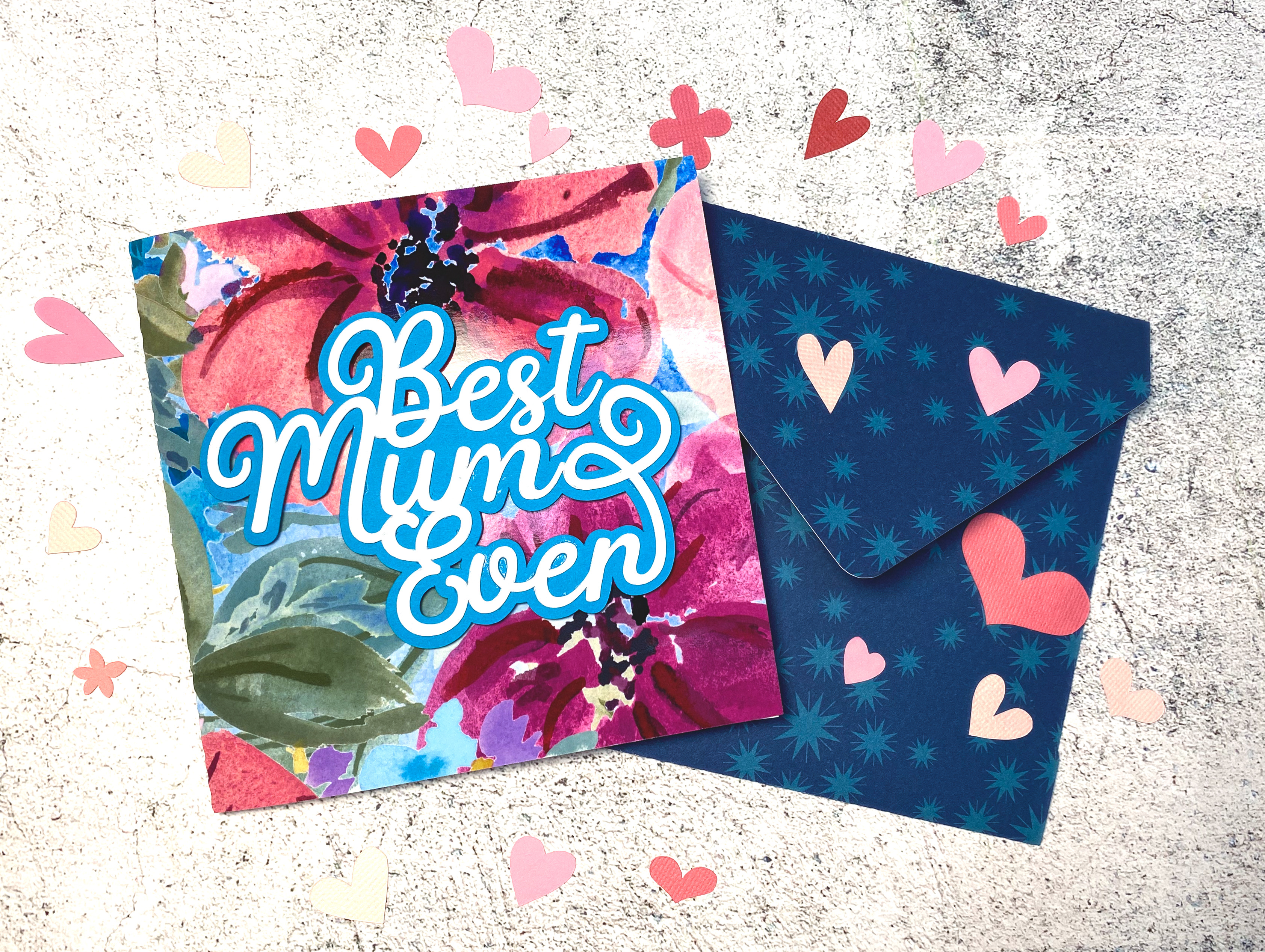
Create a heartfelt handmade card this Mother’s Day using your Silhouette cutting machine. This tutorial combines a beautiful watercolor floral background with a bold sentiment for a layered design full of colour and charm. It’s a simple but elegant way to show your love and appreciation.
Don’t miss the Instagram reel showing the process at the end of this tutorial.
Optional Envelope cutting file to create coordinating envelope – Download here
Step-by-Step Instructions:
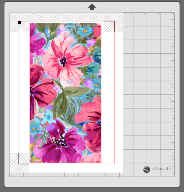
1. Create the Card Front In Silhouette Studio, draw a rectangle sized 10.2″ x 5.2″ and fill it with the watercolor floral background. To fill a shape with a pattern in Silhouette Studio, select the shape, open the Fill Panel, click the Pattern Fill tab, and choose your desired pattern from the available options or import your own. The slightly larger rectangle acts as a bleed, ensuring the background prints edge-to-edge.
2. Add the Card Template Paste the 10″ x 5″ card template over the background and centre it. This template includes cut and score lines to form your card base.
3. Enable Print & Cut Settings Turn on Print & Cut with registration marks enabled. Print the design on photo paper or white cardstock using your home printer.
4. Cut by Line in Silhouette Studio When sending your printed design to your cutting machine, make sure to cut by line colour. Turn off cutting for the larger background rectangle—this is only used for bleed and should not be cut. Ensure only the template border and score lines are active in your cut settings.
5. Fold the Card Once cut, fold along the score line to form your card base.
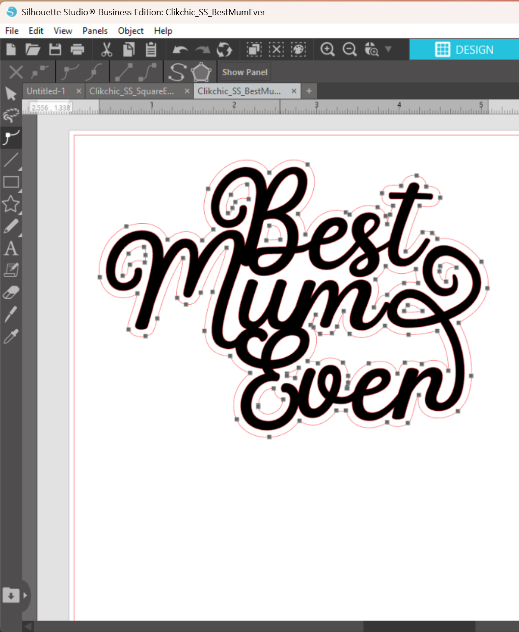
6. Import the Sentiment Open the Best Mum Ever or Best Mom Ever sentiment SVG in Silhouette Studio.
7. Cut the Sentiment Cut the sentiment from white cardstock or any colour of your choice.
8. Create and Cut an Offset Use the Offset tool set to 0.085″ to create a border for your sentiment. Adjust the offset shape as needed using the Edit Points tool, especially if you’d like to remove small inner cut areas based on your preference.
9. Assemble the Sentiment Glue the sentiment onto the sentiment border (offset layer) and let it dry.
10. Finish the Card Add adhesive foam tape to the back of the assembled sentiment and adhere it to the front of your card for dimension and impact.
Your Finished Project
A beautiful, professional-looking handmade card full of layered texture and vibrant colour—ready to make any Mum or Mom feel extra special this Mother’s Day.
Looking for the perfect envelope to match your card? Make it extra special with my Square Envelope Cutting File—ideal for creating a beautifully coordinated finish!
Scroll on to see the video of the card making process.