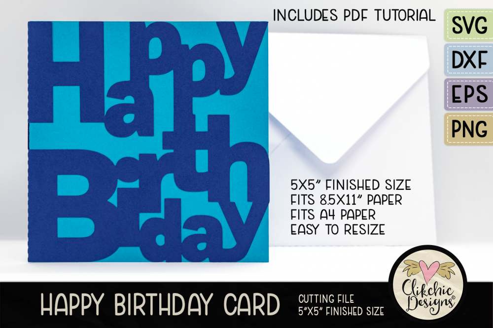
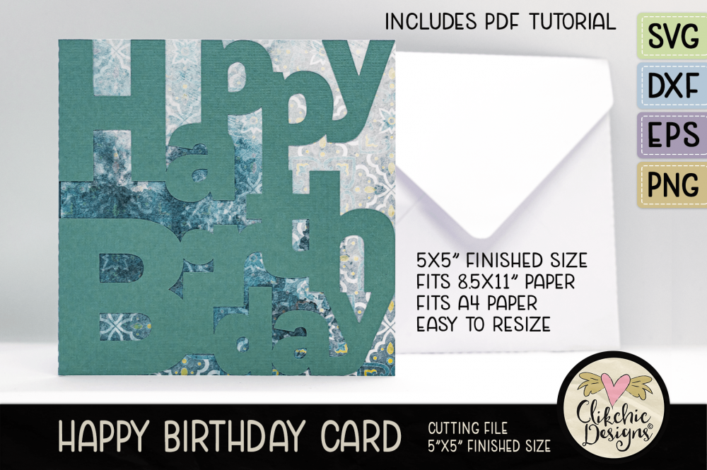
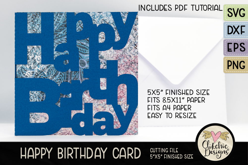
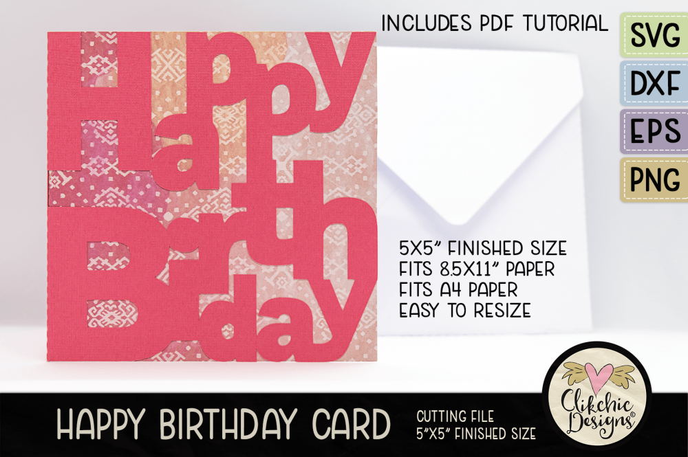
I really like the simplicity of this card. It is striking and can really pop with the right combination of cardstock papers. I chose monochromatic and plain with patterned papers in the samples below but I made one the other day in bright green and black and it turned out to be my favourite version so far even though I am not overly fond of the colour green. I must remember to make another to share a photo of. A bright colour on a black background always seems to look really striking.
If the insert is black you can overcome the issue with being able to see your writing by using a good quality white gel pen or a metalic pen of some sort. Not all gel pens will show up on black, so it is worth testing them first before buying if you are able. I chose the top chosen brand in this article and it has been a great pen choice. I orderd some silver and gold in the same brand as well but haven’t tried them out yet. Anyway! Back to the cards! Check them out in my stores below and scroll down to see the previews.
Subscribe to the Clikchic Designs Newsletter and get a FREEBIE! There are ongoing freebies as well. Don't worry, we won't inundate you with emails.
Subscribe To Our Newsletter
Subscribe to receive the latest news and updates from Clikchic Designs. Get a FREEBIE just for subscribing!
You have Successfully Subscribed!