I hosted a speed scrap and the inspiration I used was an interesting one.
One of the participants suggested right up that it was graphic style and the inspiration certainly is, but I think you could easily do a paper style layout with this inspiration also. I loved the arty effects on the photos and decided to do a similar effect on my own.
Here is the inspiration image which I found on pinterest. I loved the creative colours on the images! It looks as if the artist has blended colorful textures over the top of each image.
Right off the bat I knew I wouldn’t be able to create the same effect but I did want to try and do something similar in style. I do all my layouts in square format so the shape was going to be different also.
I had some lovely colourful photos of my kids and husband on a merry go round and thought they would be perfect for this kind of project and decided to use them for the speed scrap. When I follow a speed scrap inspiration I often try and capture the general feel of the inspiration rather than copy it perfectly and this is what I have done in my layout. I arranged four different photos on a page with a creamy coloured background underneath from my Childhood Adventures Digital Scrapbook Kit, not necessarily exactly the same layout as in the inspiration.
Prior to placing my photos on the page I edited them in Adobe Camera Raw using a split tone effect to give the photos some slightly unusual or cross processed looking colours. I teach a class on Adobe Camera Raw at Digital Scrapbook Place and one of the things you learn in the class is how to do a split tone effect.
Below is an example of one of the photos with and without the split tone effect applied.
Click on the image to see a bigger view of the example. The split toning immediately gives the photo/s a more surreal and colourful look which is the start of what I wanted to achieve.
After the photos were placed on the page I created gradients over each photo using colours in the inspiration image. I did this to give uneven colour tones to the image. Each gradient was then given an overlay blend mode to allow the colours to overlay the image below but still allow the images to show through. I reduced the opacity of each gradient to suit each photo.
At this point I found that the effect was a bit strong and I wanted to tone it down a bit.
At this point I decided to tone the colours down and to add some texture I would reuse the creamy background (from Childhood Adventures Value Collection) I used in the background, over the top of the photos with a linear light blend mode and reduced opacity. This softened those harsh and bright colours and gave the entire layout varying and interesting texture.
I then used the red paper from the Childhood Adventures Value Collection to create a rectangular journal block near the center of the page, similar to that in the inspiration image. I placed the journalling over the top of this journal paper in white to enable it to stand out clearly against the background which was also blended using the pin light blend mode. Each photo and the journalling paper also had drop shadows added for a little extra depth. (not something usually done in graphic style layouts but I like to, to add definition)
I also added a fill layer over the top of all layers with opacity reduced to zero and an inner shadow with a colour burn blend mode to create some soft and subtle borders to help retain the eye within the layout.
Below is the final layout, which as you can see looks a bit funky and arty and a little bleached out, but is an effect I quite like for something a little different.
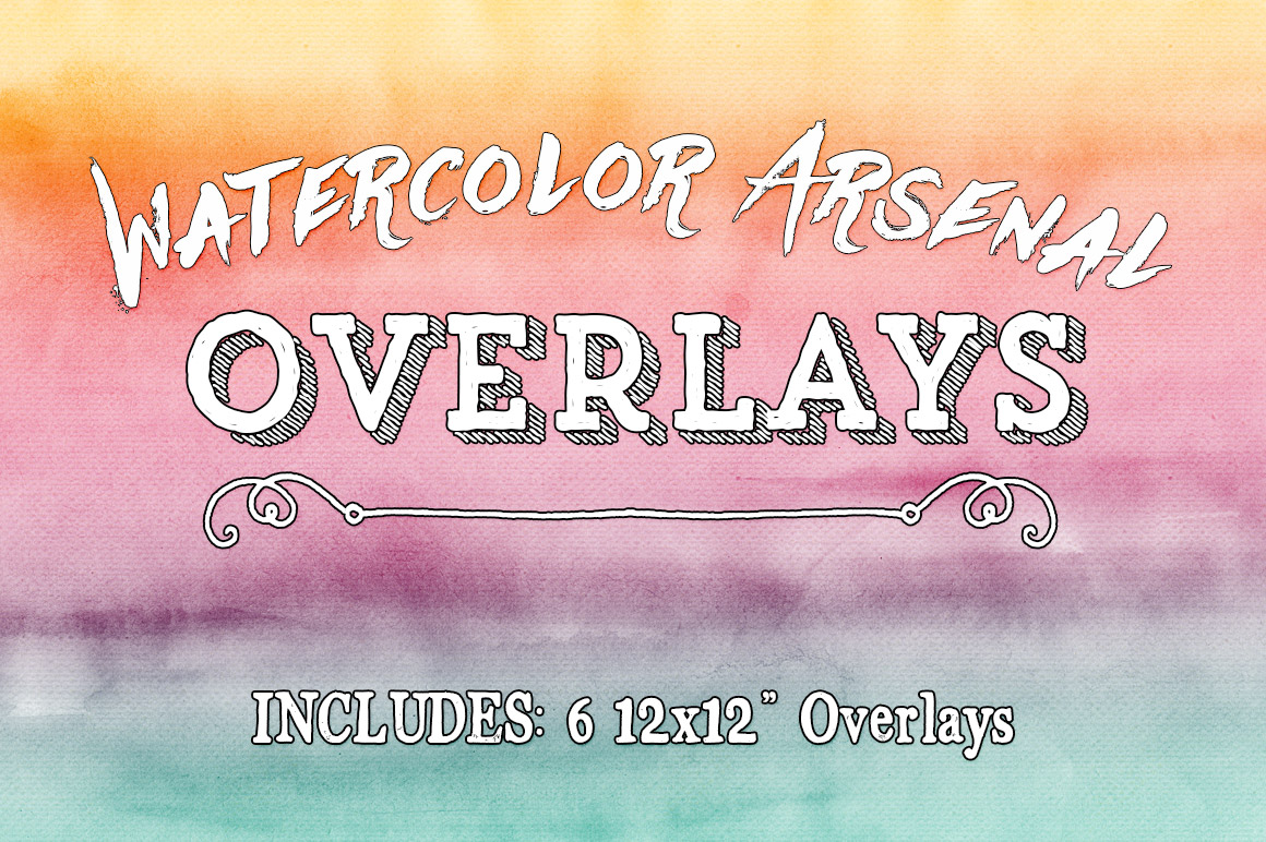
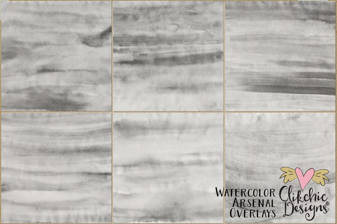
A lot of new digital scrapbookers seem hesitant to buy effect overlays because they can’t see themselves using them or are unsure of what to do with them. In this tutorial I thought I would give some quick and simple sample ideas of just how much you can do with overlays. For the purpose of this tutorial I am going to be using my Water Color Arsenal Overlays available in the following stores.
Firstly the important thing to remember with overlays is that in order to get maximum use out of them you need to be experimenting with blend modes. In Photoshop, you will find the various blend modes available to you in the Layers Palette.
For our first example I am going to use a photo. I know I often forget the interesting effects you can produce by using overlays on photos.
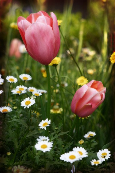
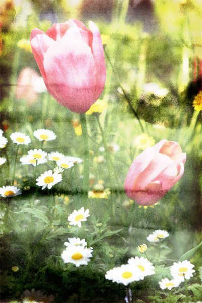
Here is the original photo of tulips and the second version, with Water Color Arsenal Overlay number 1 from the set, laid over the top and using the Linear Light Blend Mode.
As you can see, using the Linear Light blend mode, lightens the colours of the photo underneath in conjunction with the lighter colours in the overlays, and darkens the darker colours in the overlay and colours underneath giving an interesting water colour wash effect. In the following sample, I have laid two different water colour overlays on a digital scrapbook paper.
On this sample I used the Colour Burn blend mode on both Overlay layers. Colour burn tends to give a wet saturated look on lighter colours making the paper in this case almost look like wet fabric. Overlay Blend Mode will produce a softer effect to Linear Light. On the Paper below from my P365 Essentials Vol 2 Page Kit I have used the water colour overlay over the top of the paper using an Overlay Blend Mode.
The effect can be adjusted by reducing the opacity of the layer.
You can also experiment with blend modes to age your photos. The photo below is a monochrome image of my daughter taken a few years ago. Adding a water colour overlay with a Hard Light Blend Mode and 61% Opacity gives the photo an aged look. This effect works best on dark monochrome photos. You could get similar effects with different blend modes on lighter photos.
Here is the original photo and the photo with the Hard Light Blend Mode
You can enhance your special effects even further buy recolouring the overlays and using more than one overlay. There are so many possibilities available to you.
One of the most fundamental aspects of working with digital craft, graphic design, and digital scrapbooking files is being able to unzip the files you download. Windows comes with it’s own ability to unzip files and there is no need to purchase any additional software to do so. Read on to find out how to zip and unzip zip files in Windows. Scroll to the end for instructions on unzipping files a Mac Computer.
Creating and Extracting Zip Files In digital craft, graphic design and digital scrapbooking there are many occasions where you might have to deal with creating and extracting (opening) zip files. Most graphics you download, whether you buy them or whether they are freebies come in zipped files. Zip files are normally a way of compressing files to keep down the size of them as well as keeping them together in a single file rather than several separate ones.
With graphic or image files, zips often don’t reduce the file size much, if at all, however they are a very good way of keeping a collection of files together to enable easier downloading and uploading on the web. Windows provides it’s own zipping facilities, but if you do not have Windows there are several zipping programs out there which you may be able to use instead. For the purpose of this tutorial, we will explain how to zip and extract files with Windows Explorer.
Unzipping files on a Windows PC is straightforward. Here’s how to do it:
Locate the ZIP file: Open File Explorer and find the ZIP file you want to unzip.
Right-click and extract: Right-click the ZIP file and select “Extract All.”
Choose destination: Select the destination folder where you want the files to be extracted and click “Extract.”
Alternatively, you can double-click the ZIP file to open it, then drag and drop the files to your desired location. This method works for Windows 11, 10, 8.1, and 7. If you need further assistance, feel free to ask!
Zipping files on a Windows computer is easy. Follow these steps:
Locate the files: Open File Explorer and select the files or folders you want to zip.
Right-click and compress: Right-click the selected items, choose “Send to,” and then select “Compressed (zipped) folder.”
Name the ZIP file: A new ZIP file will appear in the same location. You can rename it as needed.
These steps work for Windows 11, 10, 8.1, and 7. If you need further assistance, feel free to ask!
Unzipping a file on a Mac is straightforward. Follow these steps:
Locate the ZIP file: Open Finder and navigate to the folder containing the ZIP file you want to unzip.
Double-click the ZIP file: Simply double-click on the ZIP file. This action will automatically start the unzipping process.
Access the unzipped content: Once the process is complete, a new folder with the same name as the ZIP file will appear in the same location. Open this folder to access the unzipped files.
Alternatively, you can right-click the ZIP file, select “Open With,” and choose “Archive Utility” to unzip the file. This method is useful if you have multiple unzipping tools installed and want to specify which one to use.
For those of you new to digital scrapbooking communities, galleries and social media sites, you may never have had the need to save images for viewing on the web before. Read on to find out how to save your images for web use to enable fast viewing and to be able to upload to online galleries. Images viewed via the web do not need to be the same resolution as images saved for printing, as the maximum viewing resolution on a monitor is 72dpi. Images should also be compressed to allow for quick displaying of images when viewed via the internet. The image should also be smaller in size than that to be printed out, as viewing size on a monitor is much smaller than that being printed out.
This tutorial explains how to save images for sharing on the web or in online galleries.
When your digital scrapbook layout is complete, the first step is to flatten your layers. Doing this prevents your layer styles from needing to be rescaled when your image sizes is reduced, which can happen on occasion, particularly in Photoshop Elements.
To flatten your layers, go to the layers palette and click on the more button in PSE or in Photoshop, the small button with a triangle pointing to the right of your screen.
From the menu which appears select flatten image.
This will flatten all the layers in your layout to a single layer.
After you have done this it is time to resize your image. In the Digital Scrapbook Place gallery, the maximum size you can upload to our gallery is 125kb. In your image menu, select Resize> Image Size. (or in Photoshop just select Image Size)
In the window that appears, you can select the size you wish to make your image. (600×600 pixels is a fairly standard gallery size)
Firstly ensure that Resample Image is checked so that you are able to access the pixel dimensions portion of the window. (constrain proportions should also be checked) In the Width and height the maximum amount of pixels should be 600. You may make it smaller if you wish however 500-600pixels is a good viewing size for the web. For a square image, you can resize it too 600×600 pixels, and for rectangular images, the maximum Width or Height is 600pixels. Just change the largest Dimension to 600 and providing Constrain Proportions is checked, the other dimension will change automatically. Once you have changed the amount of pixels to 600 or less, click on ok. This reduces the viewing size to a suitable size for viewing on the web.
Next we need to save our image for the web. This allows us to reduce file size as much as possible without reducing viewing quality. (do not use this method for layouts you wish to print)
Go to your file menu and choose Save for Web. (or Save for Web and Devices in newer versions of Photoshop)
A new window will appear with two versions of your image. (in Photoshop you may need to click on the 2 Up tab) On the left is your original image and on the right is the sample of the image as you adjust its compression settings.
In the Preset box, ensure that you have JPEG selected in the box for file types. To the right of this box is a Quality box. This is where you adjust your compression level. Adjusting the level in the Quality box directly effects the file size shown under your sample image. The aim is to get the maximum viewing quality possible, with minimum file size. Play with the levels in the Quality box and see how it affects your sample image in comparison to your original image. Brightly coloured or high contrast images tend to be larger file sizes than lower contrast images.
To be able to upload your image to many digital scrapbook galleries, your image file size must be less than 125k. Check the file size under JPEG shown as above below the sample image. Generally speaking you should be able to keep your images under 100k for most layouts. If you need to zoom in to get a better view of the effect of the compression, you can click on the magnifying glass at the top left and click on your image to zoom in. (hold down the alt key and click to zoom back out). You can also optimise for File Size and choose the Maximum File size of your image.
Once you are happy with your adjustments, click on the Ok button.
Be sure not to overwrite your high resolution images by saving as the same name. You might like to put -web or -lowres at the end of your file name to indicate that the image is a low resolution image for web/email viewing.
Once you have named your file and chosen an easy to remember place on your hard drive to save it, click on Save, to save your new, low resolution version of your image.
Tip: When going back to your image in PS or PSE, remember not to re-save your original as your full printing size will be lost. You may wish to undo your sizing and layer changes before saving again, or in Photoshop you can click on Revert in the File menu to revert to the last saved version.
Have you ever wondered how to tear digital paper and make it look real? Learn how to do realistic paper tearing in photoshop.
Realistic Paper tearing in digital scrapbooking is something that can be done in many different ways, here my version of digital paper tearing. This tutorial is done in Photoshop CS, however the basic principles will apply in other versions of Photoshop and Photoshop Elements. You may also be able to apply the principles to other software packages. Select the layer you wish to apply the torn edges to by clicking on it in the layers palette. Then click on the ‘Add Layer Mask’ button at the bottom of the window (second from the left) to create a layer mask. Creating a layer mask allows you to make changes that can be easily removed from the layer at any time. To make changes to the layer mask, click on the square showing to the right of your layer thumbnail. This is your layer mask thumbnail.
Using black on your layer mask will erase from the layer much like the rubber tool and using white will bring it back. This makes it is easy to correct any over brushing by using white.
Select your brush tool from your tools menu on the left hand side.
I like to use the Rough Round Bristle for creating my torn edges but it is worth experimenting with different brushes to see which you prefer for the effect you are after. Adjust the brush size according to your layout and the size needed for the desired effect. For this layout I set mine at about 150px. Make sure you have selected black from your colour palette and begin brushing the edges of your paper, photo or matt. Ensure that the brush opacity is set at 100%.
With this particular brush it is usually necessary to go over any dark pixels that have not been properly erased to ensure you have a clean torn edge. Once you have finished creating your edge with the black brush select the layer in your layers palette below the one you are working on and then create a new layer. This will place a new layer underneath the layer you are creating the torn edge on.
To do this click on the little arrow in a circle on the top left of your layers window and select new layer.
I like to once again use the Rough Round Bristle for the under portion of the torn edge. Once again you might like to experiment with different brushes to get different effects. This particular brush gives a nice textured effect to this portion of the torn edge. Select an appropriate colour to match your paper or photo. In the case of photos I like to use white as photos are printed on white paper and give a white torn edge. For coloured paper I would use a slightly lighter shade of the same colour. Choose a brush size for your desired effect. I used approx 150 once again.
Begin painting the torn portion of the paper on the layer beneath your photo or paper by dragging your brush along the middle of the edge of your torn paper. You may wish to tidy up the edges with your rubber tool and by selecting the same brush. Once you have completed the edge on your photo or paper you may wish to apply a drop shadow to this layer.
To apply a drop shadow select Layer, Layer Style and then Drop Shadow from your menu.
Adjust the settings to suit your layout. Different colours will require different shadow strengths and the further the paper away from the layers below the softer and larger the shadow will be. The closer it is the darker and smaller the shadow will be. For the sake of realism in a paper style layout I prefer to keep my shadows quite small and subtle. Fiddle with the Opacity, Distance, Spread and Size settings to achieve your desired effect.
You may wish to apply further effects on the torn edge portion of the paper, in this case the white portion or the layer beneath your paper or photo. You may wish to apply textures similar to that of the above layer, or a texture to simulate torn paper. Some people like to add noise. Personally I do not think this technique requires any further textures or effects but this will differ according to taste and the style of your papers and layouts. I also like to slightly lower the fill opacity of the white torn edge. Again this is a matter of taste and may not suit your paper or layout. You may prefer to use the rubber tool for this purpose with a lowered opacity to brush over the edges to simulate the effect of the thinned edge of torn paper.
There are many different methods of creating a torn paper edge, and this is the one I like to use for my layouts and kits.
Anyone who joins the online digiscrapping communities will notice the popularity of blinking avatars and ‘blinkies’. This tutorial teaches you how to easily create your very own blinking avatars and blinkies in Photoshop CS-CS5.
There are a few more steps to create a blinkie in older versions of Photoshop CS than in Photoshop Elements but once you know how you will be creating dozens of blinking avatars and blinkies! The blinkie size I have used in this instance is 125×60 pixels, another common blinkie size is 150×50 pixels. The avatar size limit on most scrapping forums is 125x125pixels so this is a good size to create your avatar’s at.
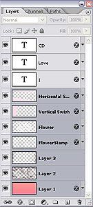
Firstly you need to create your design, and this needs to be a layered image, as showing and hiding the layers enables you to create each frame of the blinkie.
For the purpose of this tutorial I will be using the top three layers as ‘blinking’ layers for the blinkie. You can use any combination of layers you wish to create a frame for your blinkie. In this instance I will keep it simple and only ‘blink’ the top three layers.
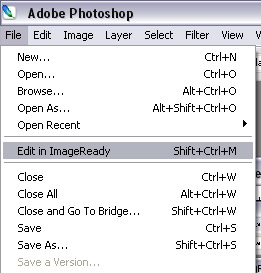
Once you have all your layers ready to go you then need to begin the animation process. To do this, go to the file menu and choose Edit in ImageReady.
Note: This step is unnecessary in Photoshop CS3+ as animations are now done within Photoshop itself. Simply click on the window menu and click on Animation to open the Animation window while still in Photoshop.
Image Ready will open up (this can sometimes take some time to load) with your image in it, and no longer in Photoshop. If you need to go back and fix something you can just choose Edit in Photoshop from the file menu of Image Ready. Be warned however if you do this you should do so before you begin the animation process as it can play havoc with your frames. If you need to do it after you have started adding new frames, first delete the extra frames and then do your editing in Photoshop before coming back to Image Ready.
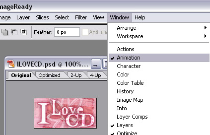
Next you need to open the Animation window, in image ready or in Photoshop CS3+.
Go to the Window menu and ensure that the Animation option is checked. This will ensure you have the animation window open.
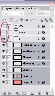
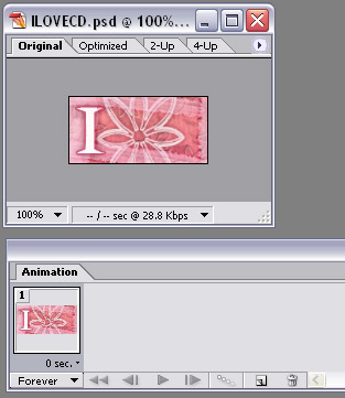
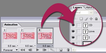
To create each frame we need to turn on the layers we want visible and off the layers we don’t. You can do this by clicking on the eye next to each layer. If there is no eye next to the layer, it means the layer’s visibility has been turned off. In the above sample we have turned off the ‘Love’ and ‘CD’ Layers which will be for the first frame of our blinkie. For this blinkie the first layer only has the ‘I’ layer visible.
Here we have the Animation window visible. This is where we create each frame of the animation. Here we need to ensure it is set to forever. This allows the blinkie to continue blinking. If it is set to once, it will only go through the frames once and then stop.
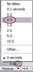
The frame delay is the length of time in seconds the frame will appear. You can set different time values for each frame if you wish. For instance if something takes a little longer to read you can make it a longer frame delay. If it is just an outside border which flickers, you can set it to a short delay so that it blinks quickly. For the purpose of this tutorial we will set all the frame delay’s at 0.5 seconds.
Once the first frame is set, following new frames are defaulted at the same value, but can be changed if you wish.
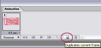
We already had the first frame ready to go, and just had to adjust the frame delay. Now we are ready to create the second frame. First we need to click on the New Frame Icon circled above.
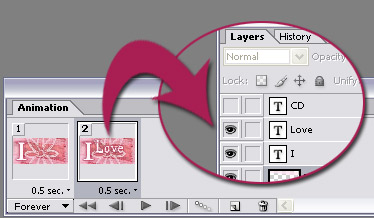
Next we need to make the layers visible that we want to appear in the second frame of the blinkie. Above shows the second layer we want visible.
Here is the third frame we wish to have for the blinkie, showing the layers which are visible for this frame. We have now finished creating the frames for the blinkie and it is now ready to be saved into gif format.
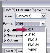
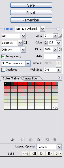
Note: In CS3+ this step is now done through Save For Web & Devices (file menu). The settings are on the right hand side of the window. If you wish to view the quality settings, click on the two up tab. This allows you to view the Original file on the left, and your adjusted settings on the right. You can use the play button at the bottom right of the window to view your animation before saving. Once you are happy with your settings click on save and save to your computer.
Photoshop CS3+ Save For Web & Devices
Back to prior photoshop versions…
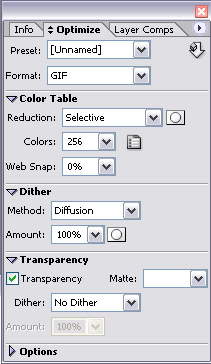
Next we need to make sure that gif is selected in the optimize palette. If you need to compress the image a little further and reduce the file size you can try adjusting the number of colours, however this can reduce the viewing quality of the image. If file size is not an issue you will not need to adjust any of the other settings.
For the purpose of this tutorial I have left all the settings at their defaults.
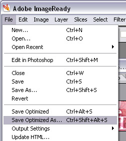
Now it is time to save our image! Go to the file menu and choose Save Optimized As. Choose an easy to find spot on your hard drive to save your blinkie and you are done!