Metadata is a method of tagging graphics and photographs in order to record important information, keywords, copyright and sorting information. Metadata is information embedded into your image files.
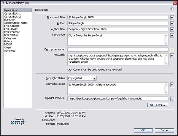
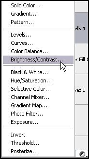
In Photoshop you are able to view metadata for an image, by going to the file menu and choosing – File Info
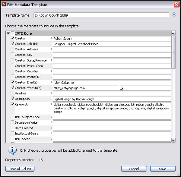
This is what the window will look like.
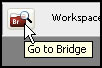
Many people who have Photoshop are unaware that a very powerful file management software is also available at their disposal. Adobe Bridge, comes with Photoshop and is accessible from the File Menu when you click on Browse. There is also a button in the Photoshop toolbar.
Once you open bridge you will have a screen that looks something like this. On the preview below I have it open on a folder that contains a kit I have designed.
On the left there is a favourites column where you can set your favourite folders. Underneath there are keyword filters with which you can filter your viewing options. The middle column displays thumbnails of the folder contents, the viewing size of which can be simply adjusted using slider at the bottom of the screen. The top right column displays the selected items, and the bottom right column can display metadata or keywords. When viewing photos, the camera settings used for the selected photo is displayed. Underneath file properties, a whole variety of information recording options.
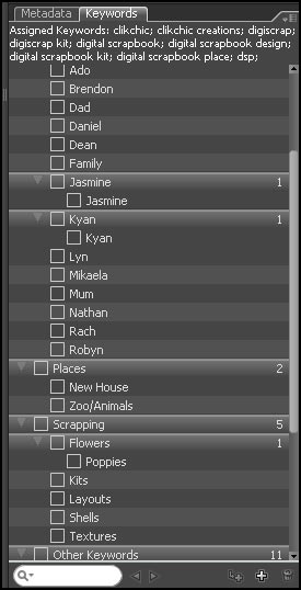
If you click on the keywords tab, you are able to view and assign keywords to each image to enable the easier location of your image files.
You can add as many standard keywords as you wish, keyword by basic colours, embellishment types subjects in a photo, and the list goes on.
Next we come to metadata. As you can see by the sample window below, you can create your own metadata templates, say for example one for each of your favourite designers, to record their design information. You could set metadata templates for colours and element types. You could include links and credit information and as much or as little information as you like.
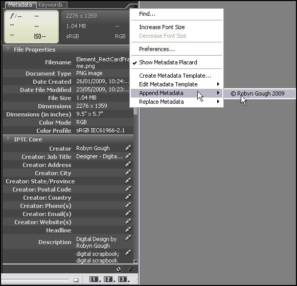
To access this information click on the drop down arrow to the right of the Metadata tab. You will see a menu where you can create and edit meta data templates. You will also see where you can add the metadata templates to your images and graphics. You have the option whether to append or replace the metadata.
You can also manually edit each field in the metadata column as needed. When you add metadata using a template, the information is automatically added to the fields above.
If you are a Photoshop user, it may be worth investigating your keyword and metadata options in Adobe Bridge before deciding whether you need to invest in image tagging software.
A wonderful technique for softening the look of your photos and reducing the effect of blotchy skin is to use the diffuse glow filter in Photoshop. You can take advantage of this wonderful filter to make a dramatic change, or just a subtle adjustment.
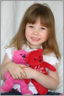
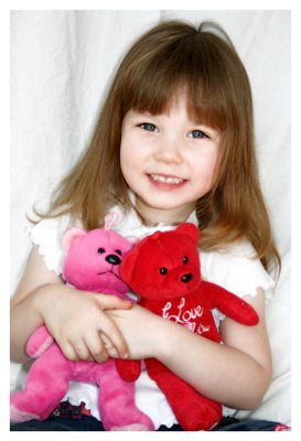
Firstly open the photo you wish to apply the filter to. You may wish to save it as (File>Save As – remember to rename the file when you save) a new file to preserve the original. For the purpose of this article we will work with this photo.
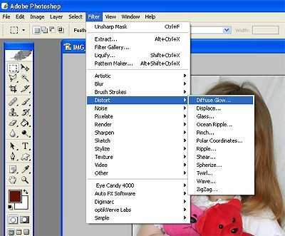
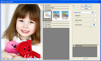
To apply the filter, go to the Filter menu > Distort > Diffuse Glow (Note: that your background colour on your colour swatches must be set to white for this to work effectively.)
You may need to adjust the zoom settings on the bottom left of the window to enable you to view enough of your image in the window provided.
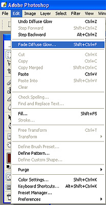
By adjusting the Graininess, Glow Amount and Clear Amount you can experiment with the settings to get the desired effect, depending on how dramatic a change you would like to achieve. I usually like to make the change a little more dramatic and fine tune the changes by using the Fade setting in the Edit menu. Once you are happy with the result, click on OK.
As mentioned above you can fine tune the changes by using the Fade Diffuse Glow option in the edit menu. This option is no longer available once you make any further adjustments to the image, so should be done immediately upon applying the Diffuse Glow filter.
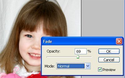
You can fine tune the Diffuse Glow settings by using the Opacity slider. Doing it this way enables easier control of the effects and allows you to better see how the adjustments effect the image.
In this instance I reduced the opacity by 69%. You may prefer a different setting depending on your image and how you applied the filter originally.
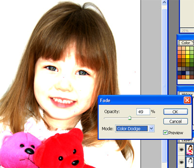
It is also possible to adjust the Mode settings to get different effects. One of the effects is shown below.
However, in this instance, I want a much softer look, and have left the Mode setting set to normal, giving the end result below.
One of the great advantages of digital scrapbooking is being able to edit your photos. If you have ever had trouble matching your photos to your layout, kit or if something just doesn’t look quite right, tinting your photo might be just what you need to do to make your layout pop. When opening an image, always use SAVE AS to save a to a new image file name so that you are not working on your original. This tutorial demonstrates some very simple Photoshop editing methods to tint your photos and make them POP!
In this tutorial we will start with this original photo.
To start with it isn’t a bad image but there is room for improvement. Making an image monochrome can really make a difference to it. Tinting it a color such as sepia can make it suit your layout perfectly. Sepia of course isn’t the only way to go, there are many different colors you can tone your images to help suit your layout.
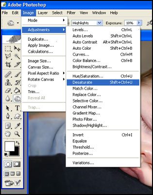
Firstly to tint an image it must first be made black and white. The way I find the easiest is to desaturate the image. To do so select Image> Adjustments > Desaturate.
Usually when desaturating an image it is necessary to boost the contrast a little. An easy way to do this can be to use the Auto Contrast tool in Image> Adjustments > and then select Auto Contrast. (also shown in menu above)
As an example here is the desaturated image below.
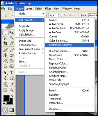
The contrast on this image hasn’t turned out too badly but often there are no real blacks and the image can look a little too grey. Boosting the contrast will give it more punch. If you wish to have a bit more control over the contrast it is sometimes more effective to use the brightness/contrast.
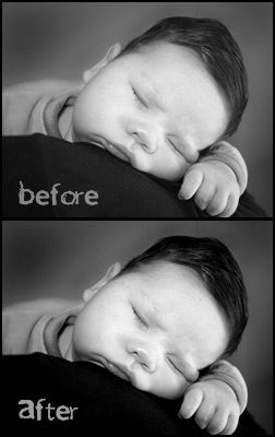
As you can see below, the second image has a bit more punch.
As is the image already is greatly improved on the original but it is only the beginning of what you can do.
Sepia toning is an age old photography technique. Photographers who did sepia toning would all have their own techniques and preferences in regard to the color of their sepia work. The digital age makes it much easier for us to experiment with sepia tones along with a myriad of other monochrome color effects.
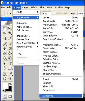
Probably the easiest method is to use variations. Image> Adjustments> Variations
This gives you a selection of thumbnails where you can assess the color changes and easily choose the color change by clicking on the appropriate thumbnail.
You can choose the extent of color variation by adjusting the Fine – Course slider. Simply adjust the image by selecting the appropriate thumbnail and clicking until you have achieved the desired colour tone and then click on Ok.
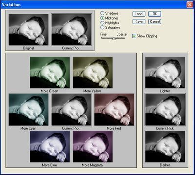
For sepia toning you are mainly working with the red tones. I like to adjust the slider to the fine level as it gives you more control and you can make the changes more gradually. Each click of a thumbnail adjusts the tonal change further.
To achieve a sepia look, you would mostly use the ‘More Red’ thumbnail to achieve the desired look. You may also like to add some yellow to make it a more yellow sepia, or more magenta to make it a bit more pink. On the sample above the tonal changes are quite dramatic as the slider is set at halfway. The changes will be a lot more gradual when set at the fine end of the slider. On the example below, I set the slider to fine, and clicked on ‘More Red’ several times to get the desired effect.
You can achieve a variety of colors by experimenting with the variations. Sometimes it might be useful to make the image blue, green, purple or whatever color you wish. It really is up to you. Some images really benefit having a funky tone added to them and it can really boost your layout to have an image tone in with it.
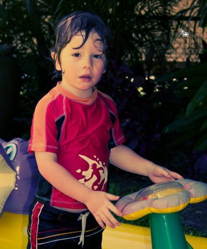
In the layout below I used blue as the main tone for the image, and then also made use of sepia to make my son really stand out.
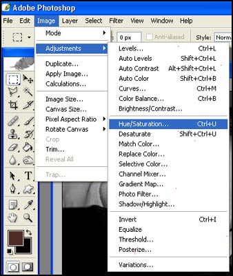
My favorite method of adjusting colors in images is using Hue and Saturation.
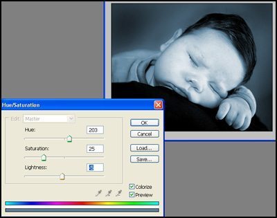
I find that this method gives you a great deal of control over the tonal range, shade and saturation of the color tinting.
To colorize an image you need to ensure the ‘Colorize’ box is checked. You can then adjust the sliders to achieve the desired result. The Hue slider allows you to select the hue or color you would like to adjust to. You can use the rainbow strip at the bottom to give a guide as to the color range and its position on the slider.
The saturation allows you to adjust how much of that color is added to the image. The lightness slider allows you to adjust the brightness of the image overall. It is good to experiment with the effects of Hue and Saturation to see what you can do. It is a very versatile tool, not only for your photos, but your layouts, backgrounds and elements as well. Once you have achieved your desired result, simply click on OK and save your image.
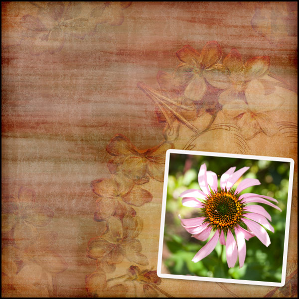
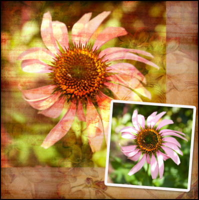
For the purpose of this tutorial I am going to do a digital scrapbook layout where the photo blends into the background paper, and a second smaller, crisper copy of the same photo for a repeated effect.
For some using blend modes in Photoshop is second nature, and it is a relatively simple method but for those who have not yet discovered it, here is a quick tutorial.
To start my layout, I have selected a background paper and feature photo.
Next I am going to place a larger version of the image on the background paper, underneath the smaller version of the image.
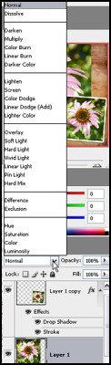
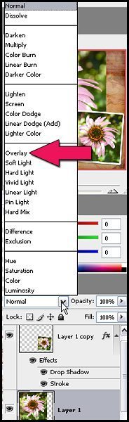
Next while the larger flower layer is selected, we need to change the blend mode. In your layers palette you will find a little white rectangular box which currently has normal selected, if you click on the drop down arrow, you will see the blend mode options available.
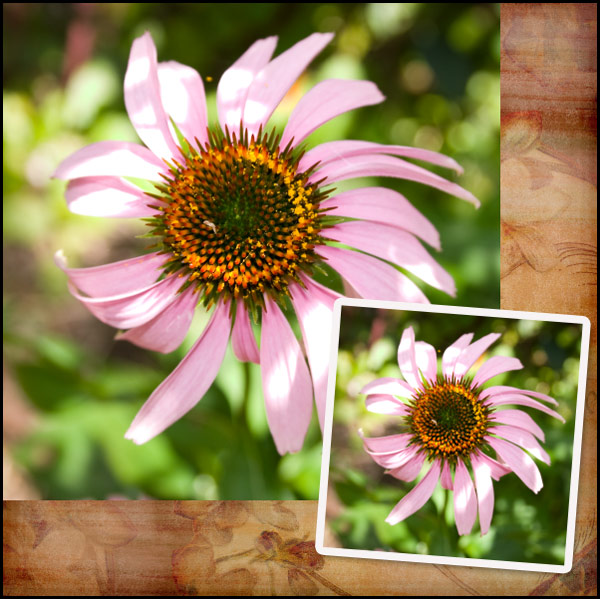
There are several different modes to choose from, and each will have a different effect and are great to experiment with but for the purposes of this tutorial we are going to use Overlay mode.
Once your layer blend mode has been changed to Overlay, your photo will look something like this.
As you can see the look is quite effective and quite vibrant, you can make it look less vibrant by adjusting the layers opacity. This will in turn bring more of the colours of the background through, and soften the colours in the overlaid photo. This option is worth experimenting with to suit your taste.
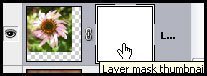
At this point while I like the effect on the photo, I feel the edges need blending into the background a little more. I like to use layer masks for this purpose to make corrections easier.
While your larger photo layer is selected. Click on the Add Layer Mask button.
This will bring up a second thumbnail next to your image in the layers palette. To ensure the mask is selected, click on the mask to show the four corners surrounding it showing it has been selected.
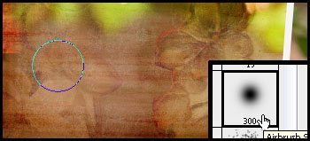
Once you have done this, you can use your black soft brush to remove portions of the image, and the white soft brush to add them.
If you make a mistake, you can simple change the brush colour to white to add back the portion of the picture you wish to. On my layout, I softened the edges two sides of the photo to blend them into the background a bit more.
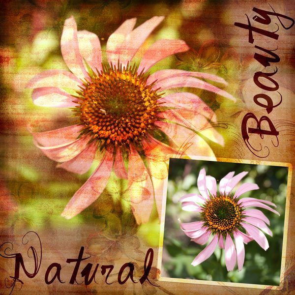
To finish off the layout, I changed the stroke blend mode around the smaller photo to overlay in the layer styles and reduced the drop shadow to bring it more in keeping with a graphic style layout.
I then added the titles in dark brown and changed their layer blend modes to Linear Light at 59% Opacity.
I also reduced the saturation of the colour in the background of the smaller photo, to help bring out the pink a little more.
What is Cross Processing you ask? Cross processing is a technique traditionally used in film processing to produce interesting and unpredictable colour effects.
Different chemicals are used to process Negative film from Slide film, and when using the chemicals for Slide Film on Negative film, wild and unusual colour variations occur. You can also achieve similar results by processing Slide Film in Negative chemicals.
With Photoshop you can achieve similar results with much less mess and much less fuss.. as well as with more predictable results. It is much easier to experiment with your results in Photoshop than it is with chemicals and film!
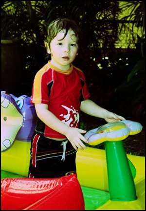
Lets start with our original photo.
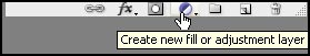
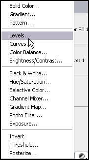
From the bottom of your layers palette choose, New Fill or Adjustment layer
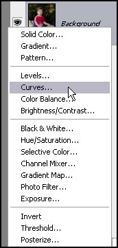
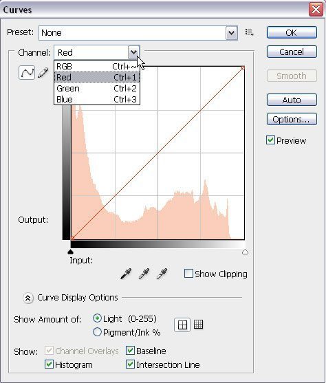
Select Curves from the menu that appears.
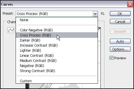
This will bring up your Curves Adjustment Layer window.
Within CS3 and possibly earlier versions of Photoshop, there is a Cross Processing Preset. This may work perfectly for your photo depending on the effect you desire, subject and the colors in your photo, but in this case I find it a bit too green for my photo.
For the purpose of this tutorial I am going to adjust RGB colours individually.
Select the Red Channel and adjust the line to form a curve above the diagonal. This will require some experimentation, as each photo will provide different results, but in the photo below the output setting is 192 and input 203 for the top curve (below the diagonal) and Output 64 and Input 98 for the bottom curve showing above the diagonal line.
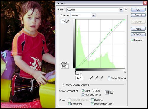
Next I will adjust the green settings. You will again need to experiment and see what looks good on your photo. My green curves are going in the opposite direction to the red.
The final curve is the blue one.
I have made this one a more exaggerated version of the red curve.
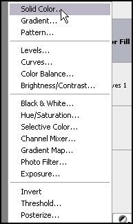
At this point I feel the image needs a little warmth so I am going to add a colour fill. I experimented a little with the colour to see what looked good.
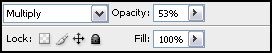
Click on the symbol at the bottom of your layers palette that looks like a half black and white circle to create a new adjustment layer and click on Solid Color.
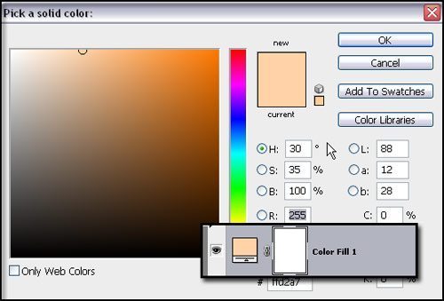
I used the colour picker to pick a light orange colour and clicked on OK, creating a new colour fill layer.
Again you will need to experiment, but for this photo, I adjusted the blend mode to multiply and Opacity to 53%.
At this point the photo needs a bit more POP as it is a bit dull. Cross Processed images tend to have high contrast often with blown out highlights and dark shadows.
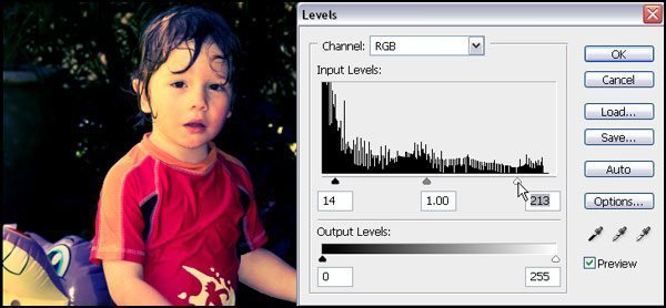
So to achieve this effect I have added a new Levels Adjustment Layer.
At this point, I moved the right hand white adjustment icon, to the left, which gives a bit more punch and contrast to the image. If you wanted to experiment a little more you could adjust each colour channel separately, but doing the RGB channel suited me for this photo.
Much closer now.. but not quite there…I still want the highlights to look a little more blown out.
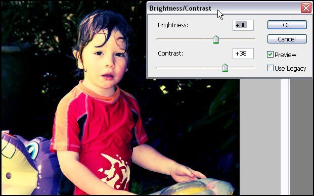
So another adjustment layer, this time Brightness/Contrast.
I think we might have it now!
This to me, looks like a classic Cross Processed Image.
Don’t be afraid to experiment, and every photo will look different. The key is not to get too hung up on technique, and do what you think looks good. Experimenting with colour curves is a great way to become more familiar with editing your images and can provide some very striking effects!
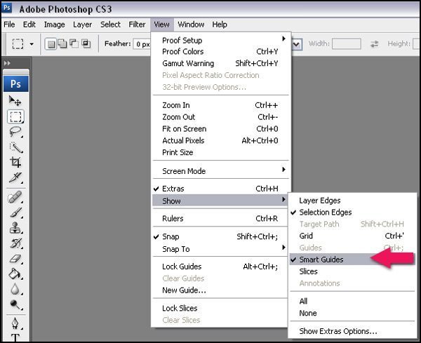
Smart Guides are a very handy tool for lining up objects on a page layout in Photoshop. They enable you to quickly and easily see if your objects are lined up without having to use rulers, grids or create ruler guides.
First we need to make sure the Smart Guides are turned on.
Go to your View menu, hover over Show and ensure that Smart Guides are checked, if they are not checked, click on Smart Guides to turn them on.
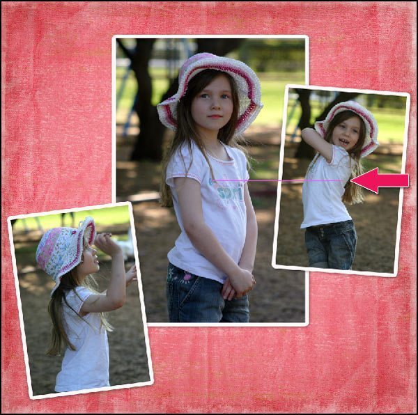
Once your smart guides are turned on, they will automatically show when you are lining up layers on your Photoshop document.
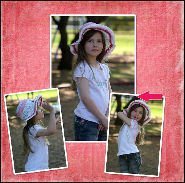
As you can see below, the smart guides show in pink when the top, middle and bottom of objects align.
The smart guides will automatically appear whenever different layers are lined up horizontally or vertically and are a great way to ensure your layout photos and elements are perfectly in line with each other. If your objects are different sizes, you can still line them up with the middle guide.
Whichever way you move your layer objects, the guides will follow and show while you are dragging across your canvas.
Whether it is a row of flowers, a collection of thumbnail photos, or word art, smart guides are a quick and efficient way of laying out your photos and elements with precise accuracy and minimal fuss.
Turn your smart guides on, and have a play, you will be amazed at how handy they are.


