There is a basic assembly tutorial which works for all my cards to date available here. With his card I wanted to include the option of having different colours for each layer of cake so if you wish to use that option some extra steps are involved.
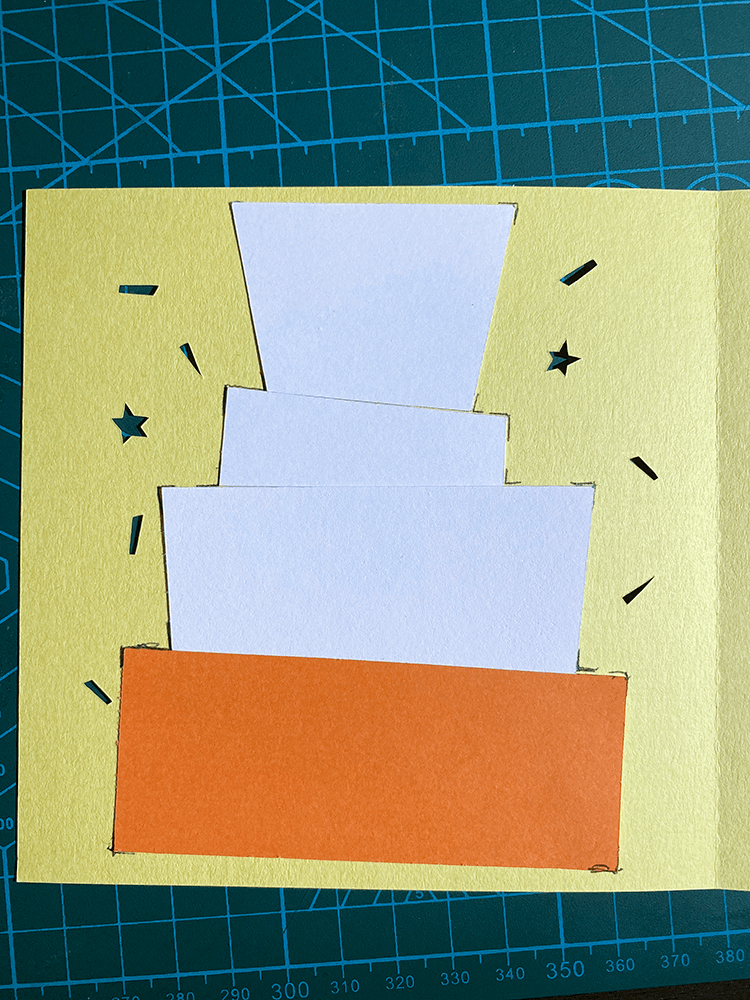
The included cutting parts for cake background pieces is optional to use to add extra colour to your card. Check out one of the links above to see the difference between a card with and without those pieces. If you wish to make a card more quickly you might choose to just use a patterned or brightly coloured paper insert. Making different cardstock colours when you have the time however gives the card a bit of pop, so I have included the cutting files to do so.
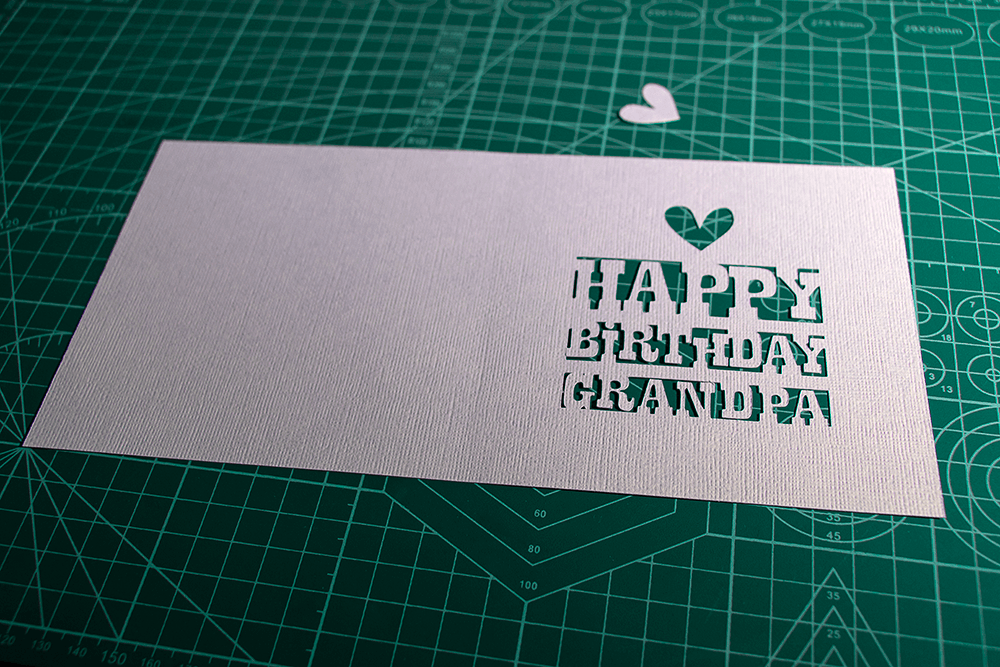
Pieces are designed to sit flush against each other inside the front of the card. Place pieces in position and check they are covering cake and swag accents correctly. The top of the top piece sits parallel with the top of the card and each piece sits flush under the other.
Tip: Mark corners of pieces while holding in place to ensure correct placement after glue is applied.
Once you have marked the corners (unless you prefer you prefer to wing it then skip the corner marking) spray the left side of the card with adhesive. If you prefer another method of gluing that is of course your choice. I used a glue stick for a while till I got the spray adhesive, but I find the spray adhesive gives better hold on the delicate pieces. I usually cover the other side with scrap paper before spraying to ensure the other side does not get sprayed.
Attach the cake pieces in the correct positions. Then once pieces are attached add more adhesive on back of cake pieces.
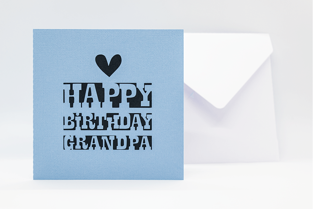
Attach the insert to the adhesive covered side of the card to complete your card.
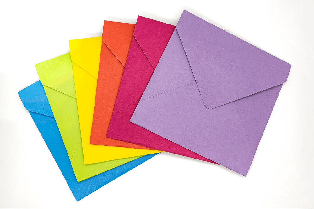
I also have envelopes available which allow you to cut envelopes with custom coordinating cardstock to suit a large range of sizes.
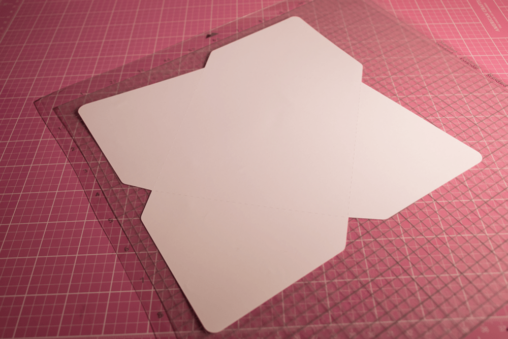
Instructions are for the Square Envelope Cutting File set are for files suitable different cutting machine types including SVG, DXF, EPS, Studio & PNG formats. Scroll to the bottom for an assembly video or continue reading for the written tutorial.
Open the appropriate file for your cutting machine software in the size to suit the card it is for. Each envelope is sized slightly larger to make sure it fits the card the envelope is chosen for. For example, the 5-inch envelope is slightly larger than 5 inches when assembled so that it will fit a 5 inch card inside it.
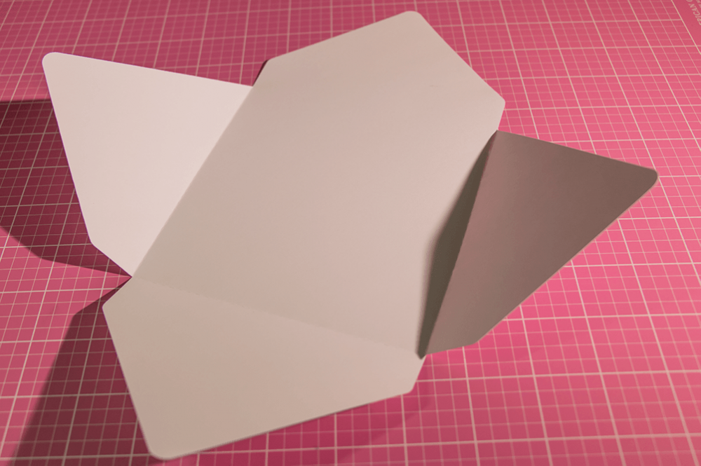
The dotted lines are designed to be score lines where you make the folds to assemble your envelope. The outer lines the cut lines to cut the shape of the envelope. Cut the file according to your machine’s software and paper settings. Make sure the score lines are set to score in your cutting machine software.
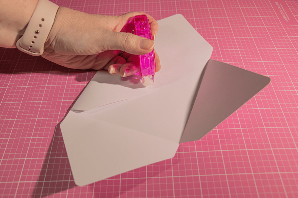
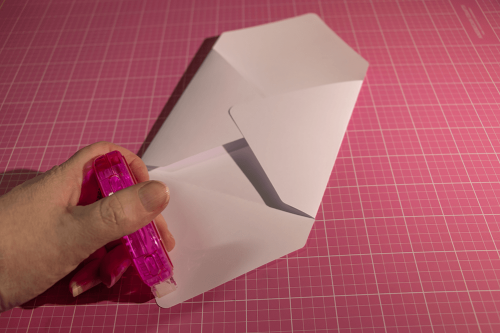
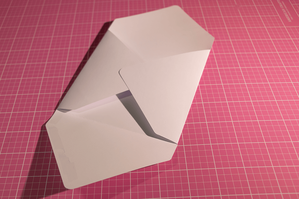
Cut the envelope as required in your cutting machine software. The top right flap is the top flap of the envelope. You will notice the edges at the top of the left and right flaps of the envelope have a straight side rather than curved angles. I like to fold the first three flaps and then open the second and third flap again so that I can apply some adhesive tape (or other adhesive) to the rounded outer corner of the left flap. Then I fold down the second flap so that it adheres to the first flap.
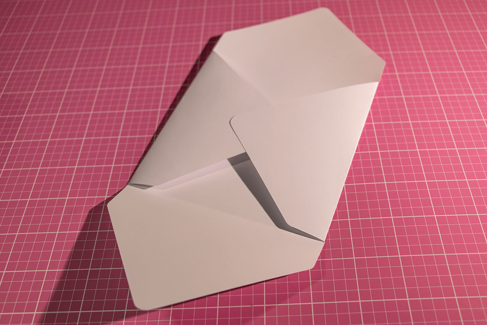
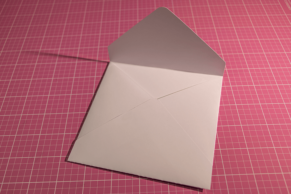
On the third or bottom flap I apply adhesive tape to the three outer edges. Once applied I fold the third flap down onto the first two. You should now have an open envelope. Fold down the top flap to close it. I usually apply a small amount of adhesive to the top angled corner of the open envelope to seal it once my card is inside. Alternatively, you could use a sticker or envelope seal.
If you are having any issues with your software, I will do my best to troubleshoot with you. I use Silhouette Studio for my cutting files, but I also have the Cricut Software to test my files in and am therefore somewhat familiar with the software. Please do get in touch leaving reviews if you have any issues. I am more than happy to help you out and would much prefer a happy customer than one who is unsatisfied with their purchase.
I also have other envelope sizes available which you might find useful for your cards and invitations. Please do also let me know if there is a particular size you are looking for and I can make that size a priority when planning upcoming designs.
Alternate available sizes are in my stores as follows.
This tutorial assumes you have a basic knowledge of using your individual cutting machine and appropriate settings for the papers you are using. If files are not cutting at the correct depth, please see instructions for your cutting machine. If your cutting machine does not use one of the above file formats, the cutting files may not work with your machine. I sell SVG, DXF, EPS, PNG & Studio formats.
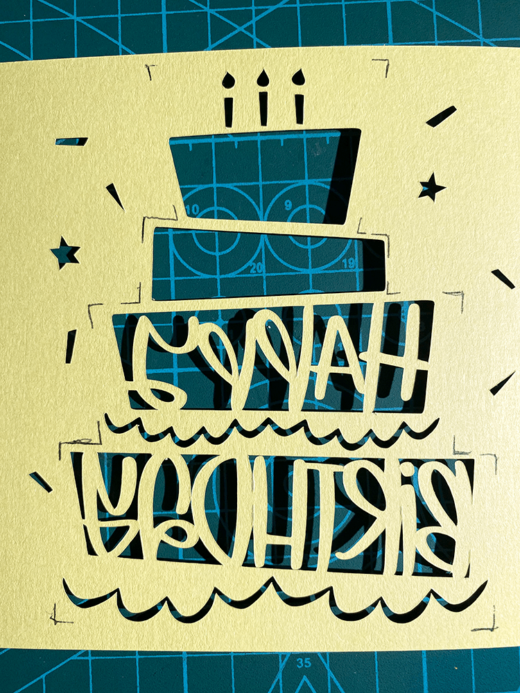
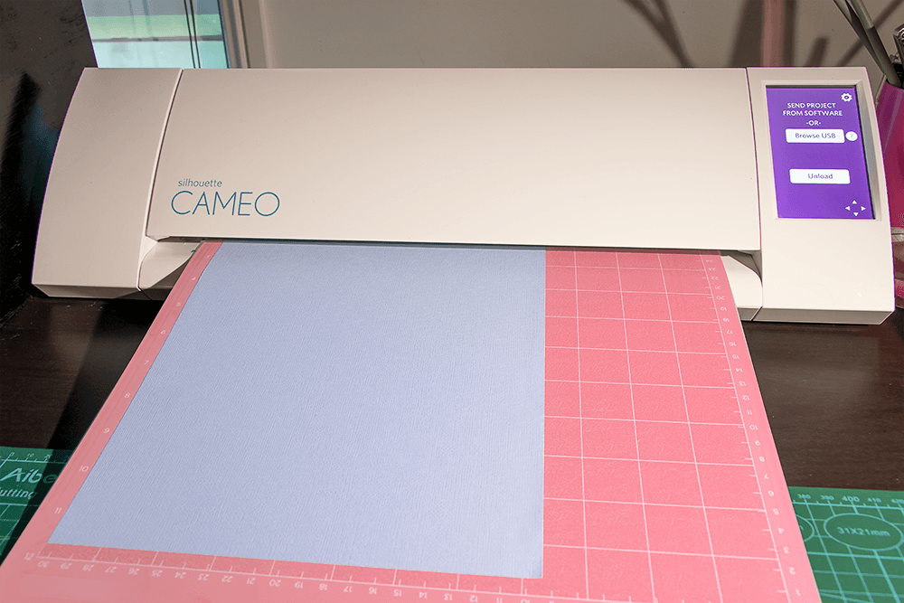
Cutting the Card Place your chosen cardstock on the correct spot on your cutting mat and insert into your machine. Open the best file for your software and choose the appropriate settings for your chosen cardstock to ensure the cut lines cut appropriately for your cardstock. Send the file to your machine for cutting.
Once your machine has finished cutting the cardstock, eject from your machine and weed the cardstock to reveal the final cut card.
Before I go any further I will post a video which some of you might find easier. I made this video assembling a different card but the assembly applies to all of my basic folded cards with inserts. If you prefer written tutorials, just scroll on further and the rest of this tutorial will continue below.
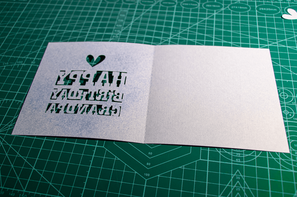
At this point you can fold the card along the score line and add the insert cardstock or paper for cutting into your machine. Ensure appropriate settings are chosen in your software and send the file to your cutting machine for cutting. Once your insert has been cut, remove from your cutting machine and weed the insert for use inside the card. Fold the insert along the score line.
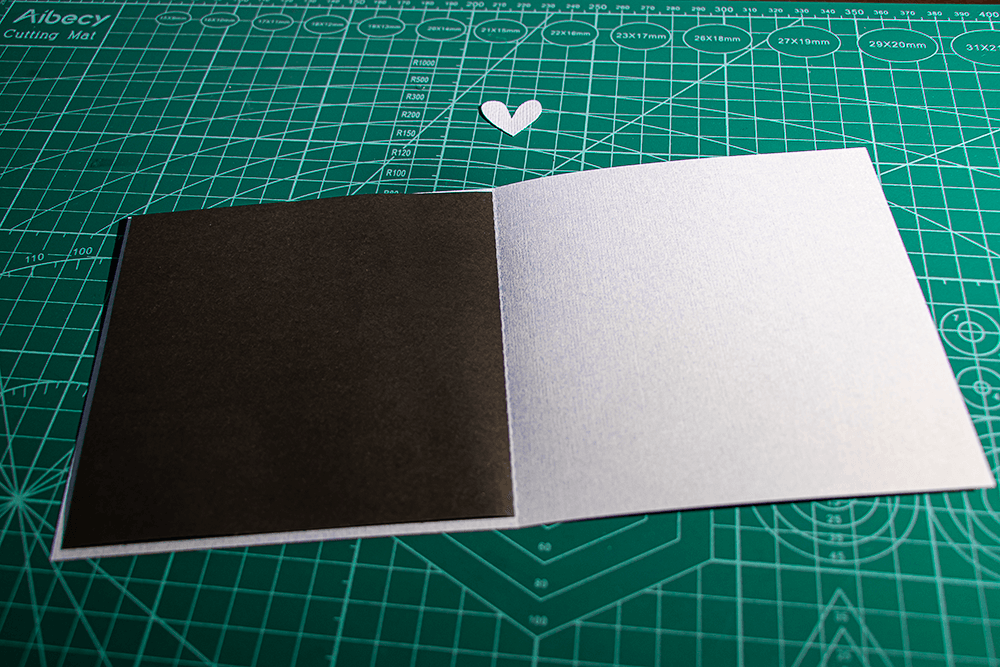
Open the card and place glue to suit your preferred opening experience. It is best to only glue on one side of the card to prevent problems with opening. Some people might prefer the front side of the insert be glued down completely to the front of the card, but others might prefer the back side of the insert be glued down. It is entirely up to you and your preferred style. Spray Adhesive works well to completely glue down insert on intricate parts of cards. When using spray adhesive, I like to cover the other side of the card with paper so that only one side is glued. With this particular card I glued the insert to the front of the card.
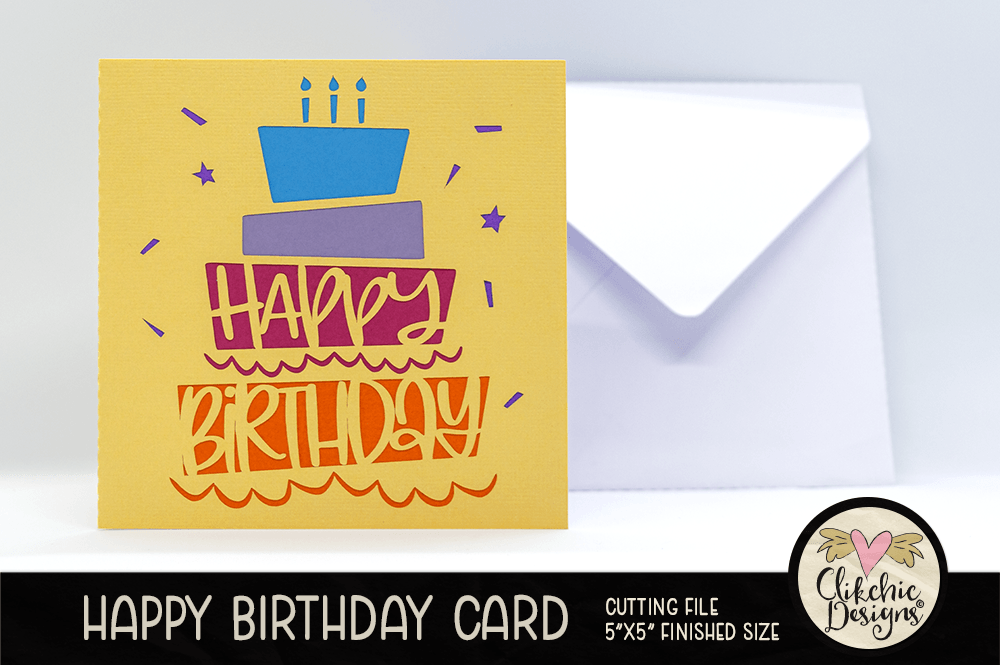
My cards are designed to be quick and easy to make. I am not someone who enjoys making overly intricate cards, but I do love being able to give people a handmade card.
I also have square envelopes available which allow you to cut envelopes with custom cardstock to make a gorgeous coordinating envelope.
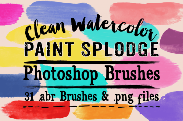
I had a question today about recoloring the png files I include with my Photoshop brushes, so I thought I would do a quick tutorial on how to recolor in Photoshop. I am using Photoshop CC for this tutorial but the instructions will work for any version of Photoshop. For the purpose of this tutorial I am going to use my Clean Watercolor Splodge Photoshop Brushes available in my Etsy store, Clikchic Designs store and Creative Market store.
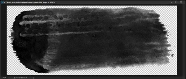
For this tutorial I am going to use the .png of the brush named Clikchic_ABR_PaintSplodgeClean_03.png.
As you can see, all the .png’s of my brushes come in black as this is the best shade for making Photoshop brushes. It is also more easy to recolor sometimes than other colors.
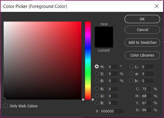
I am going to recolor the brush stroke to pink, since that is my favorite color. As for most things in Photoshop there are multiple ways to do that. For the purpose of this tutorial I am going to do it using my foreground color picker. On the toolbar on the left side of the Photoshop screen there is a tool where you can select your foreground and background colors. I am going to change the foreground color to the color I want my brush stroke to be.
The foreground color is the black square and the background color is the white square. To change the foreground color, I need to click on the black square, which will bring up the color picker.
With the color picker, I can slide the rainbow scale to the color range I want to work in and then choose the color shade from the resulting screen.
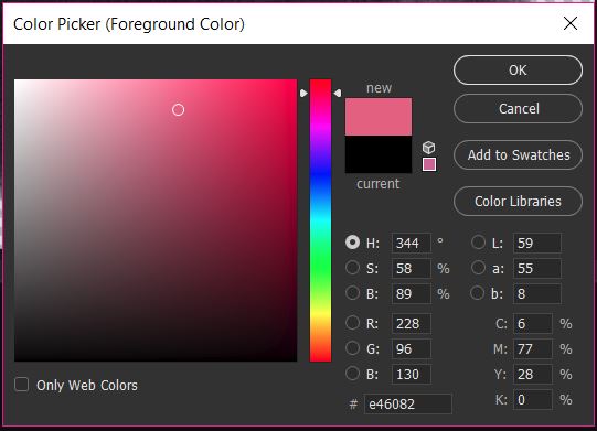
As you can see I have moved the slider up to a reddish pink and clicked and moved the cursor to a mid range pink on the gradient. The color I have chosen appears in the new rectangle.
Once you have chosen the color, click OK and that color will become your foreground color.
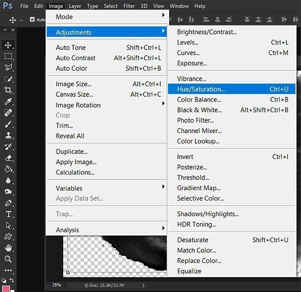
Now we have to adjust the color of the brush stroke using the foreground color. To do so we need to go to Image>Adjustments>Hue/Saturation
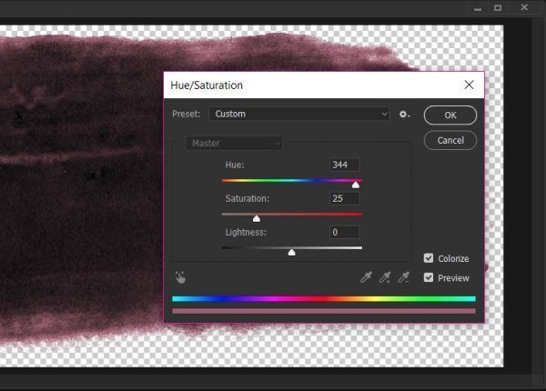
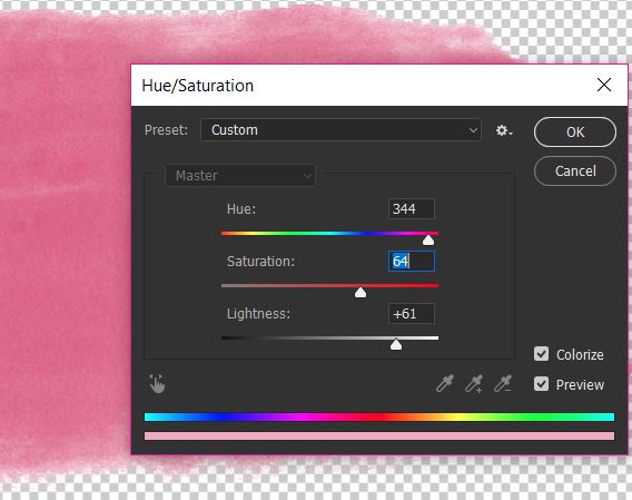
In the Hue/Saturation screen you need to click on the Colorize check box which will change the color tone of the brush stroke to your foreground color. In my example this is a dark shade of pink. The black of the stroke is a much darker shade than the pink so we need to adjust this to get the correct shade.
To do this we need to adjust the saturation and lightness. To do that you move the sliders till you are happy with the shade of your chosen color.
As you can see I have increased the lightness by quite a bit, and have also increased the saturation to get a good depth of color.
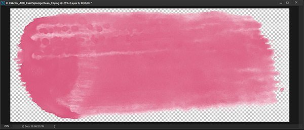
This is the end result of the recolored paint stroke.
You now have a gorgeous colored stroke and can now save as a new file so that you preserve the original in black.
Photographic Composition can have a dramatic effect on the impact of your photographs.There are several easy techniques which you can use help improve your photography.
Distracting Backgrounds
Distracting Backgrounds can spoil an otherwise great photo. For instance, a brightly coloured object behind the subject, say a child, can draw your eye away from the subject. I took a snap of my daughter when she was 2 while she was playing in the backyard. The background was the plain green of the grass apart from one distracting element, a bright red swing in the background. The bright colour drew your eye away from the main subject. It was such a nice natural candid shot it was a shame to have it spoilt by the swing in the background.
Wherever possible it is best to keep an eye out for such distracting elements when taking your image and change your position or recompose.However this is not always possible and in this case I was able to remove the swing with the help of the clone tool in Photoshop.
Fill the Frame
Another way to avoid distracting backgrounds and maximise photo impact is to fill the frame with your image. Because the frame is filled with the subject it draws and holds your eye on the subject. Simplifying the photo further by converting to black and white can also dramatically improve an image, or simply give a different feel or mood.
Depth of field
Depth of field can also help with distracting background elements. Using a narrow depth of field works to keep the field of focus on the subject and details in the background are blurred out. In the case of using long lenses, you might also get bokeh effects which are commonly a pleasing (and currently popular) effect created by the shape of the shutter and sometimes becomes apparent with narrow depth of field and highlights in the background of an image. If bokeh highlights are too bright however, they too can be distracting. You can avoid bokeh effects by using shorter lenses.
Rule of Thirds
It is not always best to fill the frame as sometimes you need to show more to tell the story. Sometimes positioning the subject in a certain way can add tension to the image. A common technique is to use the ‘rule of thirds’. When using this technique you mentally divide the frame into thirds by way of horizontal and vertical (mental) lines. The points at which these lines cross are the best points to position the subject to take advantage of maximum ‘tension’ and compositional ‘correctness’ emphasise the feel or mood.
It can be very tempting to place a subject in the centre of the image. Using the rule of thirds makes an image more interesting to look at and increases tension and balance. Below is a photo of my son being born with him positioned in the centre of the frame. Also shown is the same image cropped using the rule of thirds to add interest to the composition. This format makes the image more interesting to look at and adds tension. Take a look and decide for yourself.
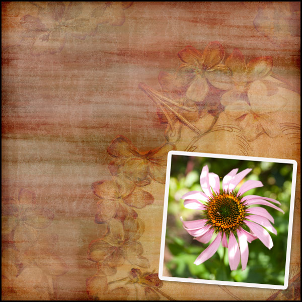
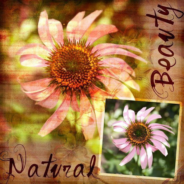
For the purpose of this tutorial I am going to do a layout where the photo blends into the background paper, and a second smaller, crisper copy of the same photo for a repeated effect.
For some using blend modes in Photoshop is second nature, and it is a relatively simple method but for those who have not yet discovered it, here is a quick tutorial. To start my layout, I have selected a background paper and feature photo.
Next I am going to place a larger version of the image on the background paper, underneath the smaller version of the image.
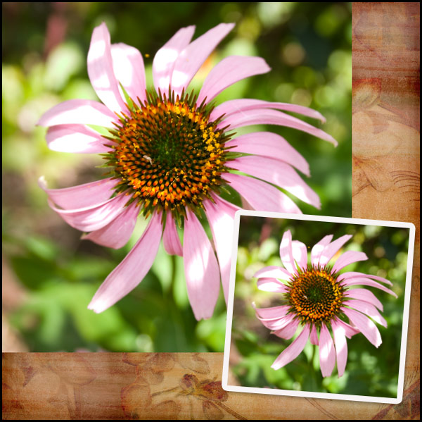
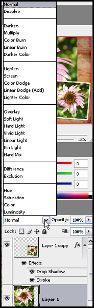
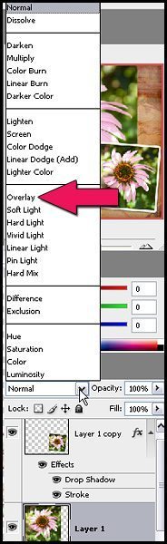
Next while the larger flower layer is selected, we need to change the blend mode. In your layers palette you will find a little white rectangular box which currently has normal selected, if you click on the drop down arrow, you will see the blend mode options available.
There are several different modes to choose from, and each will have a different effect and are great to experiment with but for the purposes of this tutorial we are going to use Overlay mode.
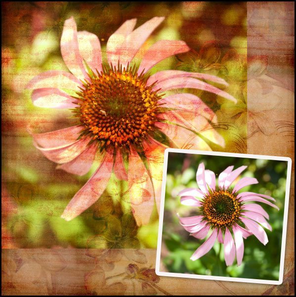
Once your layer blend mode has been changed to Overlay, your photo will look something like this.
As you can see the look is quite effective and quite vibrant, you can make it look less vibrant by adjusting the layers opacity. This will in turn bring more of the colours of the background through, and soften the colours in the overlaid photo. This option is worth experimenting with to suit your taste.
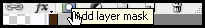
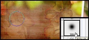
At this point while I like the effect on the photo, I feel the edges need blending into the background a little more. I like to use layer masks for this purpose to make corrections easier. While your larger photo layer is selected. Click on the Add Layer Mask button.
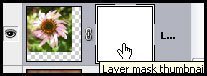
This will bring up a second thumbnail next to your image in the layers palette. To ensure the mask is selected, click on the mask to show the four corners surrounding it showing it has been selected.
Once you have done this, you can use your black soft brush to remove portions of the image, and the white soft brush to add them.
If you make a mistake, you can simply change the brush colour to white to add back the portion of the picture you wish to. On my layout, I softened the edges two sides of the photo to blend them into the background a bit more.
To finish off the layout, I changed the stroke blend mode around the smaller photo to overlay in the layer styles and reduced the drop shadow to bring it more in keeping with a graphic style layout. I then added the titles in dark brown and changed their layer blend modes to Linear Light at 59% Opacity. I also reduced the saturation of the colour in the background of the smaller photo, to help bring out the pink a little more.