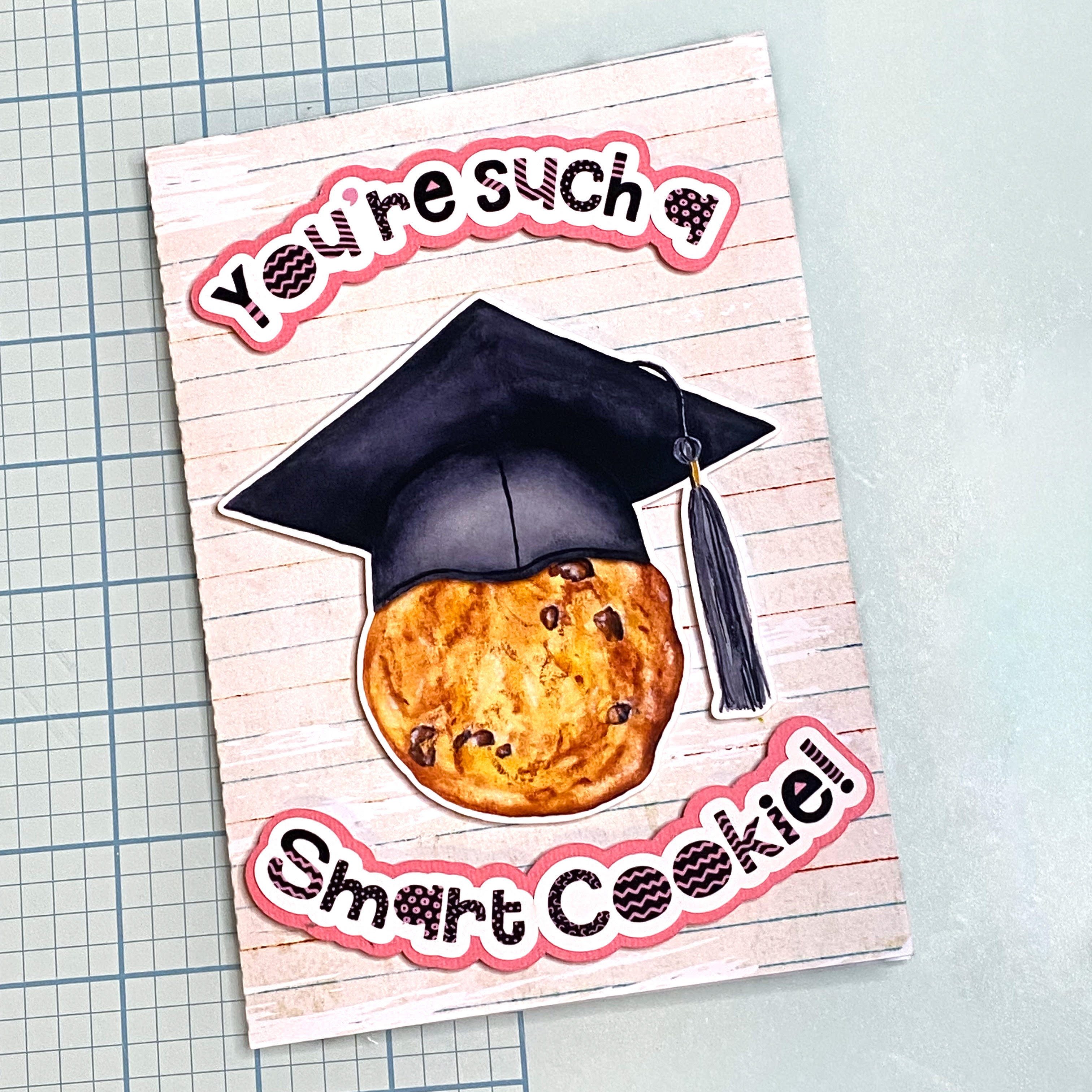
Graduation is the perfect time to get creative with your cutting machine and whip up something extra special. Today I’m showing you how to make a fun and cheerful graduation card using my Smart Cookie Graduation Print & Cut File, You’re Such a Smart Cookie sentiment, and coordinating Vintage Grade School Lined Paper Background and Dry Paint Grunge Clipping Mask Frame. This design set is perfect for celebrating all those clever cookies heading off to their next adventure. Don’t miss the instagram reel here showing the process or check it out from the bottom of this tutorial.
Use the Dry Paint Grunge Clipping Mask Frame to create a beautifully distressed border around your background design, as shown in the full tutorial linked here. This grunge clipping mask adds a textured, handmade look that pairs perfectly with the school-themed lined paper. If your card design fits within the Silhouette print and cut registration area, you can take advantage of the Print & Cut feature for crisp, accurate cuts. My card was a 5×7 size, which exceeded the print and cut limits, so I made an approximation for placing and cut with my Silhouette Cameo instead. You can also score and cut the card base by hand, especially if you prefer a more flexible workflow. While I don’t often hand-cut, it’s a great backup when needed. shape. It is not often I opt for that option. Usually only if I make a mistake and need to fix an error!
Step 2: Print & Cut
Open the Smart Cookie with Graduation Cap and matching sentiment in Silhouette Studio®, then copy and paste them onto a new project page. Resize the elements to suit your preferred card dimensions—for example, a 5×7″ card front works beautifully. Enable registration marks and arrange to fit within cut borders for accurate cutting, making sure none of the design enters cross hatched areas. Then print the design onto high-quality photo paper or white cardstock for the best results. Load the printed sheet into your Silhouette cutting machine and let it precisely cut each element. Be sure to keep the original sentiment cut line intact, as you’ll need it to create an offset layer for a clean, professional-looking sentiment border.
Step 3: Cut Sentiment border
Choose a piece of coloured cardstock to use as the sentiment border, then create an offset from the ungrouped sentiment outline in Silhouette Studio®. To do this, select the ungrouped sentiment outline and click the Offset tool from the right-hand toolbar—it looks like a small star icon. Adjust the offset distance to your preference for a balanced border around the sentiment, then cut the offset shape from your chosen cardstock to add dimension and contrast to your finished card.
Step 4: Assemble Your Card
Use adhesive to glue the sentiment border to the back of the sentiment pieces. Use foam tape or adhesive to attach the Smart Cookie and sentiment pieces to the front of the card for dimension. You can also pop up the cookie separately for extra depth!
Step 5: Add Finishing Touches
Consider adding enamel dots, twine, or a little glitter to bring even more charm to your finished piece. You could even personalise the inside with a printed message or handwritten note.
This smart cookie card is a playful way to congratulate someone on their big achievement. It’s quick to make, full of personality, and totally customisable for any age or stage.
Looking for more cardmaking designs or coordinating elements? Check out the rest of the Clikchic Designs collection.
When it comes to precision cutting machines for crafting, two names dominate the market: Cricut and Silhouette. Their flagship models—the Cricut Maker 3 and the Silhouette Cameo 5—are both powerful, versatile tools, but which one is right for your creative needs? Below, we compare the machines head-to-head, including a deep dive into their respective software: Cricut Design Space and Silhouette Studio.
Machine Comparison
The Cricut Maker 3 is celebrated for its ability to cut over 300 materials, from delicate fabrics to dense materials like balsa wood and leather. It works with Smart Materials, enabling matless cutting up to 12 feet in length. Its adaptive tool system supports a wide range of specialist tools, including rotary blades, knife blades, foil transfer tips, debossing tips, engraving tips, and scoring wheels, providing flexibility for intricate and professional projects. While the Maker 3 does not have a built-in roll feeder, a separate Cricut Roll Holder accessory is available to feed Smart Material rolls easily for longer cuts.
Silhouette Cameo 5 excels in precision cutting and offers standout innovations. It handles over 100 materials and cuts up to 3mm thick, making it ideal for thicker media such as foam, leather, and chipboard. The Cameo 5 introduces an improved roller and pinch grip system for enhanced material control and alignment, contributing to cleaner, more consistent cuts. It also features quieter operation than previous models, includes a built-in roll feeder for vinyl, and is compatible with the Electrostatic Mat accessory for delicate materials like paper and vellum. The Cameo 5 also allows users to pause and resume cutting jobs, offering additional flexibility for larger or multi-step projects. Combined with precise print and cut registration, these features make it a favourite among detailed craft enthusiasts and small business owners.
Software Showdown
Cricut Design Space is a cloud-based platform that’s beginner-friendly and designed to help users jump into crafting quickly. It has an intuitive interface and allows free uploads of SVG files and images. While Design Space itself is free, some designs and fonts are part of Cricut Access, a monthly subscription service offering expanded content and convenience for frequent users. For advanced users, however, Design Space may feel slightly limited in terms of fine-tuned design flexibility compared to traditional graphic design programs.
Silhouette Studio offers a robust set of design tools even in its free version. It supports precision editing, advanced layering, and custom path creation for users who want greater creative control. Some premium features, like SVG import and advanced rhinestone tools, require paid upgrades, but these are one-time fees rather than ongoing subscriptions, providing lasting value for those who design frequently.
Pros and Cons
Cricut Maker 3
Pros:
Beginner-friendly and easy to use
Compatible with a wide range of tools and materials
Matless cutting with Smart Materials
Supports a variety of specialty tools (engraving, debossing, scoring, etc.)
Ideal for quick, professional-looking results
Cons:
Limited offline functionality
Less design flexibility for complex projects
Subscription needed for full access to Cricut Access content
Roll holder requires additional purchase
Silhouette Cameo 5
Pros:
High design precision and control
Excellent print and cut registration
Cuts up to 3mm thick materials
Improved roller and media handling system
Built-in roll feeder for vinyl projects
Compatible with Electrostatic Mat for delicate media
Pause and resume cutting jobs
Free software with powerful tools
One-time fee for software upgrades (optional for advanced features)
Cons:
Steeper learning curve for beginners
Paid upgrades required for some professional features
Final Verdict
Choose the Cricut Maker 3 if you want a user-friendly, highly capable machine that offers excellent versatility across a wide range of materials and tools. It’s an ideal choice for hobby crafters, educators, and small business owners who value ease and speed.
Opt for the Silhouette Cameo 5 if you’re looking for maximum design control, detailed precision cutting, flexible media handling, and software that can grow with you. Its robust feature set makes it an excellent choice for professionals, serious hobbyists, and businesses needing greater creative freedom.
Affiliate Disclosure: This post may contain affiliate links. I may earn a small commission at no extra cost to you. Thank you for your support!
Silhouette’s range of cutting machines offers something for every maker—from casual hobbyists to professional creators. Whether you’re crafting stickers, large decals, or dimensional artwork, choosing the right machine depends on what materials and sizes you work with. This comparison of the Silhouette Cameo 5, Portrait 4, Curio 2, Cameo 5 Plus, and Cameo Pro MK-II includes feature highlights, compatibility, and maximum cut lengths to help you make the best decision.
Screenshot sourced from Silhouette America website.
Silhouette Cameo 5
A versatile machine suited for most crafters, the Cameo 5 supports matless cutting and works with Smart Materials. It offers a cut width of 12 inches and a cut length of up to 16.5 feet with a roll feeder, making it ideal for large vinyl signage, decals, and banners. It also features dual carriage support and Bluetooth connectivity for wireless cutting.
Silhouette Portrait 4
This compact machine, the Portrait 4 is perfect for smaller spaces and projects. With an 8-inch cut width and a cut length up to 60 feet when using compatible roll materials, it punches well above its size for projects like labels, planner stickers, and short vinyl runs. It also supports matless cutting and AutoBlade adjustments.
Silhouette Curio 2
The Curio 2 is made for specialty projects requiring depth and detail, such as embossing, debossing, etching, and stippling. It features a cutting width of 12 inches, but cut length is limited to 12 inches due to its flatbed design and electrostatic media hold system. It isn’t intended for long materials but excels in layered and textured work.
Silhouette Cameo 5 Plus
All the power of the Cameo 5 with a wider 15-inch cutting area and a maximum cut length of 16.5 feet with matless materials. The Cameo 5 Plus is ideal for larger designs like wall decals, signs, and oversized HTV applications. Perfect for serious hobbyists or side-hustlers needing more space and flexibility.
Silhouette Cameo Pro MK-II
The largest and most powerful machine in the lineup, the Cameo Pro MK-II supports 24-inch-wide materials and cut lengths of up to 60 feet, making it ideal for commercial applications, bulk orders, or large-format work. It includes dual carriage support, Bluetooth, and compatibility with Smart Materials and roll feeders.
If you’re a beginner, the Portrait 4 offers value and surprising power for its size. If you’re focused on textured and specialty media, the Curio 2 is unmatched. For general versatility, the Cameo 5fits most creative needs. For larger projects, the Cameo 5 Plus and Pro MK-II offer extensive width and length, ideal for pros and business owners.
Affiliate Disclosure: This post may contain affiliate links. I may earn a small commission at no extra cost to you. Thank you for your support!
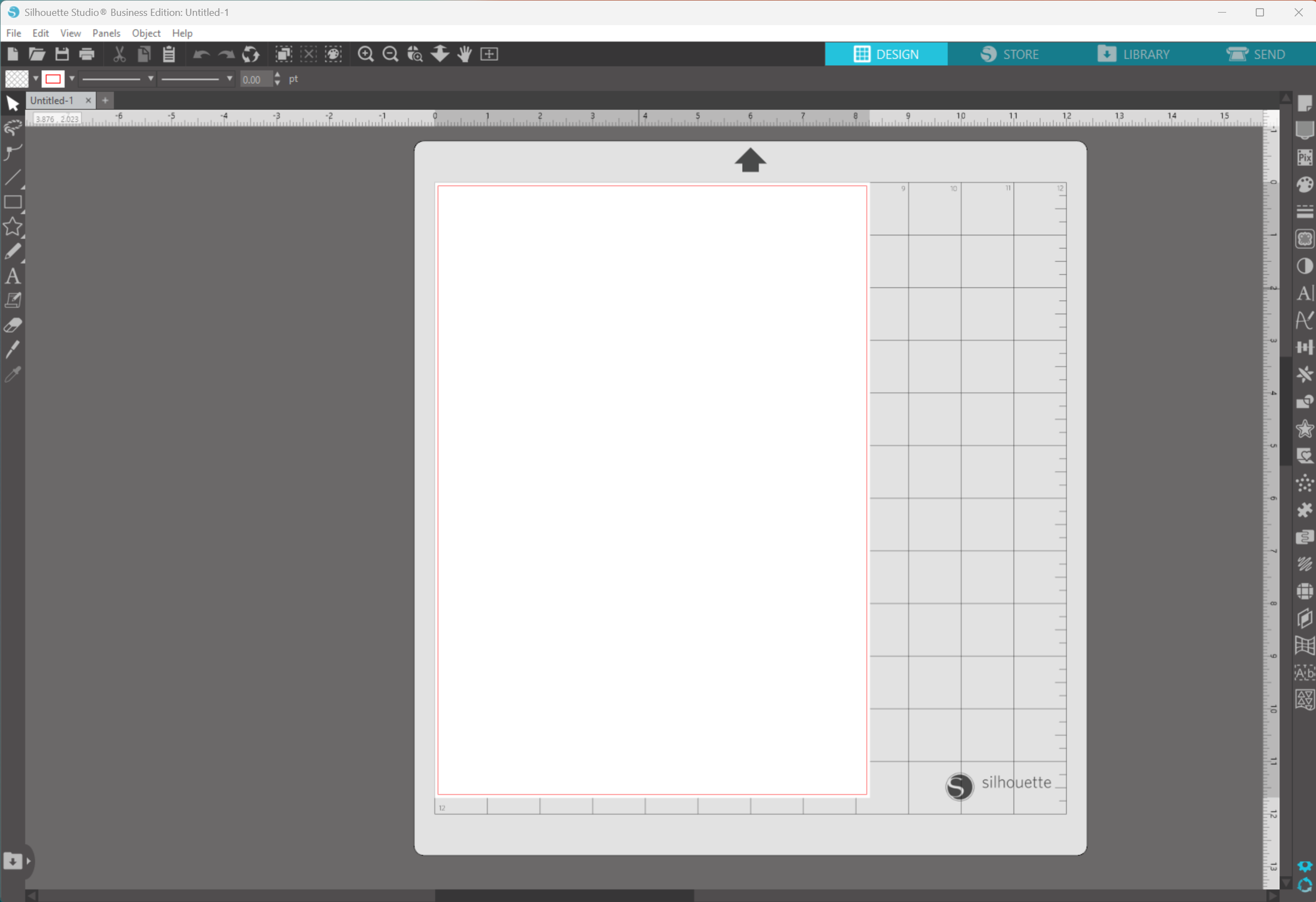
Silhouette Studio is the powerful design software that drives all Silhouette cutting machines, including the Cameo, Portrait, and Curio (US links). While the Basic Edition is free and comes with every machine, Silhouette also offers three paid upgrades—Designer, Designer Plus, and Business Edition—each unlocking more advanced tools and functionality. Choosing the right edition depends on your crafting style, file preferences, and whether you’re creating for fun or for a business. Scroll on for more info and don’t miss the feature comparison at the end of the article.
The Basic Edition is the default version and includes all the essential tools you need to get started. You can draw basic shapes, use text tools, trace images, access Print & Cut features, and send projects to your Silhouette machine. You can import file types such as JPG, PNG, BMP, and DXF, but SVG files are not supported in this edition—one of the biggest limitations for users who want to use purchased or custom SVG designs from third-party sources.
This edition is perfect for casual crafters who primarily use Silhouette’s own Design Store or create simple designs within the software itself.
Designer Edition
The Designer Edition is a popular upgrade for hobbyists ready to expand their design options. One of its most important features is the ability to open and import SVG files, which allows you to use a much wider range of digital cut files beyond Silhouette’s proprietary formats. This edition also unlocks:
Advanced knife and eraser tools for more precision editing
The layers panel for better control over multi-element designs
Rulers, guides, and alignment tools for perfect layout
Nesting feature to reduce material waste
Sketch tools for drawing and editing
If you purchase SVG designs from marketplaces or other designers, the ability to import and work with them makes the Designer Edition an essential upgrade.
Designer Plus Edition
The Designer Plus Edition is tailored to users who craft with a variety of materials and media. It includes everything in Designer, with the addition of:
Rhinestone tools, allowing you to create custom rhinestone templates
Embroidery file import support (such as PES, DST, EXP)
Advanced fill options like gradient and pattern fills
Flexishapes tools for customizable shape creation
This edition is ideal for crafters who work with fabric, embroidery, or mixed media, and need more versatility in their designs.
Business Edition
The Business Edition is the most feature-rich and is designed with commercial users in mind. It includes everything in the previous editions and adds:
SVG, PDF, and JPEG file export, great for sharing designs or using them in other software
Multi-cutter support for managing multiple Silhouette machines at once
Automated tiling, useful for large designs split across multiple mats
Media layout tools, including weeding lines and barcodes
Enhanced nesting tools for optimising material use
Matrix copy and object-to-path tools for fast duplication and layout
If you’re running a craft-based business or need to streamline high-volume production, the Business Edition provides powerful tools to increase efficiency and expand creative control.
Which Edition Should You Choose?
If you’re a beginner, the Basic Edition is a great way to start exploring the Silhouette ecosystem. However, if you want to use SVG files, the Designer Edition is the most cost-effective upgrade and unlocks major design flexibility. For those working with embroidery or rhinestones, Designer Plus is a smart step up. And for anyone running a craft business, the Business Edition is the clear choice, offering commercial-grade functionality.
Each edition builds on the one before it, so upgrading is seamless. Choose based on your current needs, but also consider what features you may want access to in the future.
The chart below gives you a comprehensive list of features for each edition of Silhouette Studio.
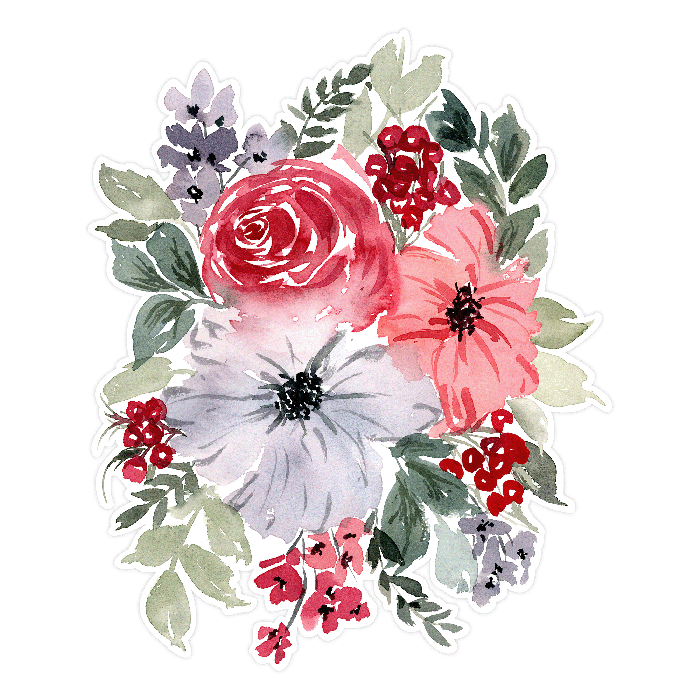
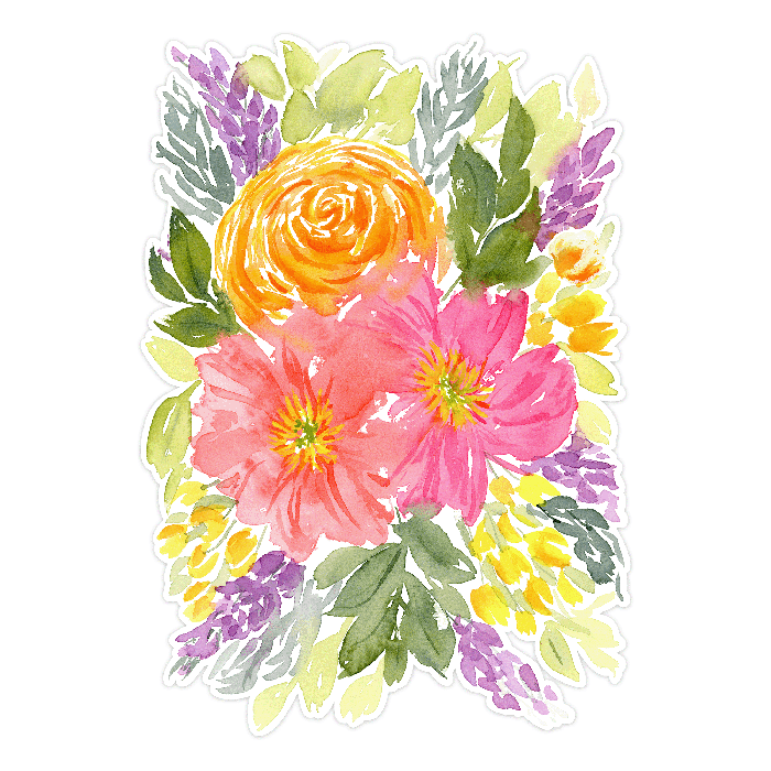
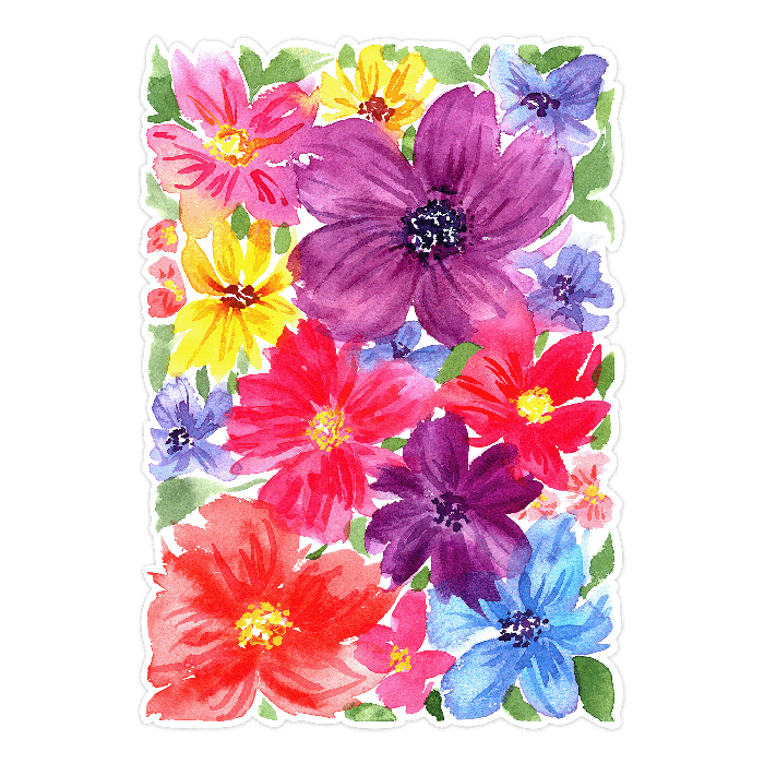
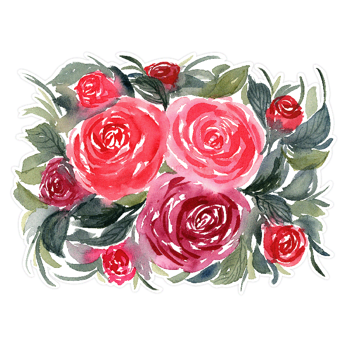
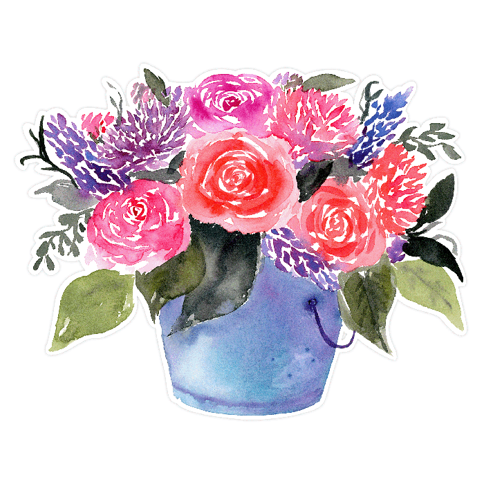
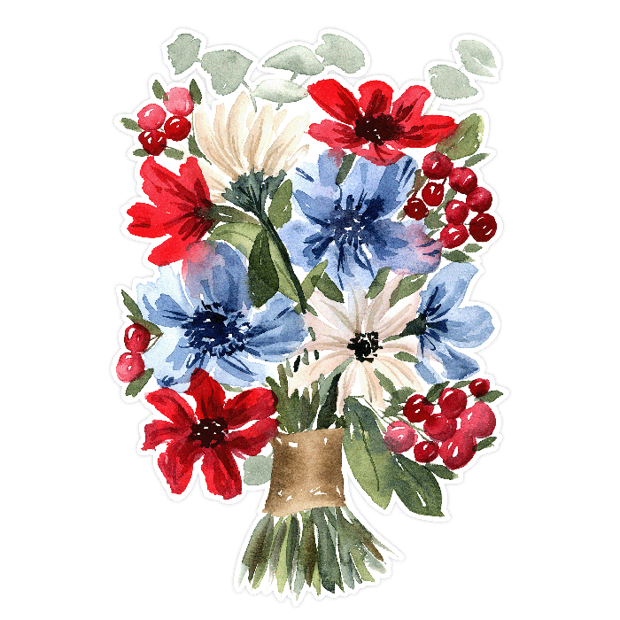
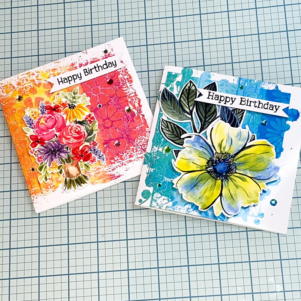
One of my favorite things to do when designing is hand-painting watercolor flowers. Flowers are a versatile subject for crafting projects, making them perfect for card-making, scrapbooking embellishments, stickers, and many other creative uses. I often paint watercolor flowers for the Silhouette Design Store and would love to share some of my latest print-and-cut designs that I adore using in my own projects.
Click on the images in the gallery below to go directly to the design in the Silhouette Design Store.
I created a process video to demonstrate how to cut files using the Silhouette Cameo. These floral designs look stunning when printed and add a beautiful touch to cards and scrapbook pages! In the video, the featured design is reduced in size and duplicated to fit four on a page. I aim to make the starting designs as large as possible to fit on an 8.5×11 inch print-and-cut page, maximizing usage options. You can find this Lavender Watercolor design here in the Silhouette Design Store.
Unlock your creativity with exquisitely detailed SVG files, perfect for crafting captivating clipping mask effects in Silhouette Studio. While highly intricate SVG or Studio files might not be suitable for cutting due to their abundance of tiny elements, they shine when used as printable framed backgrounds and photos. These versatile designs elevate cardmaking, art journaling, and scrapbooking projects. Additionally, consider using them for sublimation printing on t-shirts and mugs.
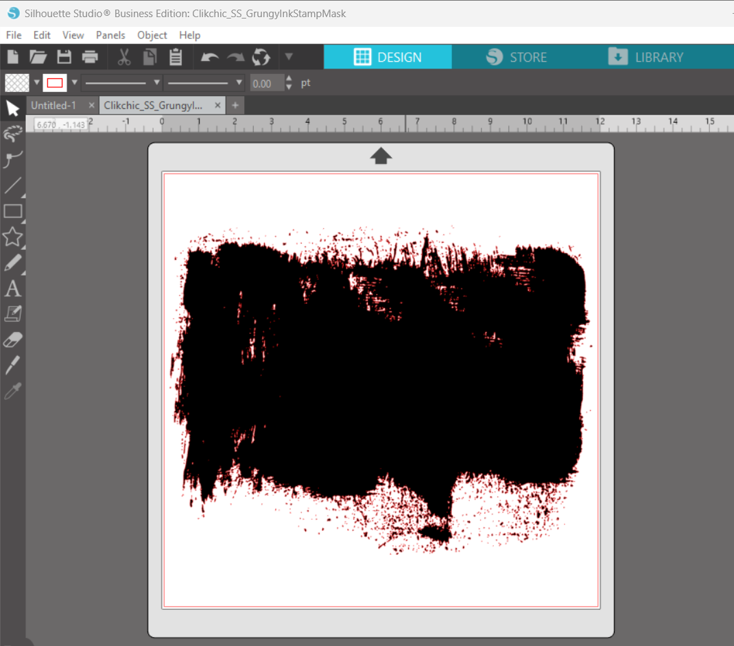
I converted this stunning Grungy Ink Stamp Mask to an SVG/Studio file for Silhouette Studio thanks to Elly Mae Habets from Silhouette Secrets. Elly’s more in depth tutorial also provides more information on how to use this design effectively. Be sure to explore her blog for more details! Elly Mae also shares fantastic tutorials on her YouTube channel (well worth subscribing to!), covering various crafting techniques and tips. Additionally, her active Facebook group offers excellent tips and support for Silhouette enthusiasts
Please Note that the file I am about to use is not suitable for cutting due to its intensly detailed and glorious grungy goodness.
Note: The png masks would require tracing before use which can data heavy and may require patience as your computer works to process the image. The SVG versions of the files are less detailed and less data heavy but can still be slow depending on the power of your computer and what you are trying to do.
Once you have opened the file in Silhouette Studio it will look something like this.
Note: The many tiny details are not suited to using as a regular cutting file.
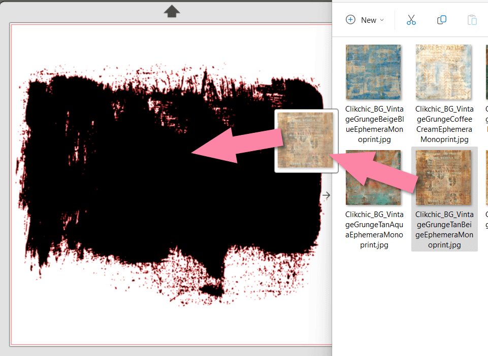
Next open your file browser and find a background pattern you would like to have shaped by this gloriously grungy clipping mask and drag it to the open SVG Mask in Silhouette Studio.
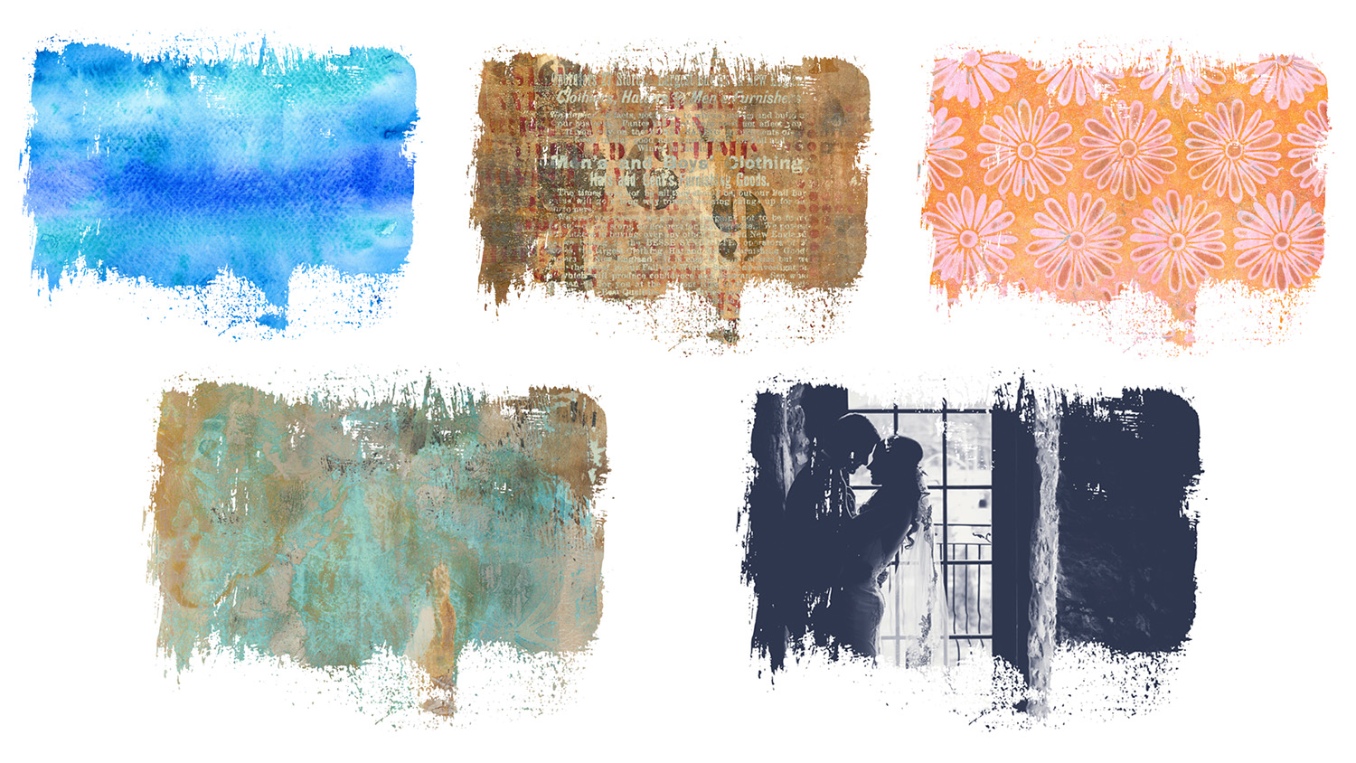
Once the pattern has been dragged to the Grungy Ink Clipping Mask SVG it will “clip” to the shape of the mask and give you that gorgeous grungy edge. Once you have done this ensure the clipped image is selected and then click on the red rectangle top left of your tool bar and click on the white and grey cross hatches to change the outline to transparent to ensure it doesn’t print. Then you can print as desired and use for your crafty cards and scrapbook pages, art journaling or for sublimation. There are so many possibilities only limited by your imagination!
Here are a few more examples of patterns I added to the clipping mask. Don’t forget, you can do it with photos too!